



























Social Commerce

How to Design a Link in Bio Page That Converts

Design a link in bio page that converts: one primary action, links ordered by intent, a branded setup your team can edit, and the data that says what to cut.

4 min read

Updated: Sep 3, 2026

Cluttered white desk with laptop, notebooks, sticky notes and potted plant

A link in bio page converts when it asks for one thing. The pages that don't are the ones listing every campaign the brand has run since March, in the order they were added. Fix the order and the count first. Design comes third.

TLDR: One primary action on the first screen, three to five links in total ordered by buying intent, on your own subdomain, with click data for each destination so you can cut what nobody taps.

How to design a link in bio page that converts, in 6 steps

  1. Name the one action. Book a call, buy the thing, join the list. Write it down before you open the editor. If you can't pick one, the page won't pick one either.
  2. Put it first, above the fold. On a phone, that means the primary button is visible without scrolling, under the profile image and one line of context.
  3. Order the rest by intent. Closest to buying at the top, browsing at the bottom. Shop before newsletter, newsletter before "latest video", latest video before "about us".
  4. Cut to five. Every link you add takes clicks away from the first one. Five is the ceiling, and three is usually better.
  5. Label by outcome, not by object. "Get the pricing" beats "Pricing". "Book a 15-minute call" beats "Contact".
  6. Tag every destination. Put a UTM on each link, so next month you can say which one earned the visit instead of guessing.

Three-dimensional thumbs up icons representing social engagement converting into clicks
Attention arrives in a burst after a post. The page has to be ready before the burst, not after.

What goes above the fold

The first screen has room for about four things. Spend them carefully.

  • Who you are, in five words. The visitor came from one post and may not know the brand.
  • The primary button. Full width, high contrast, verb first.
  • One line of proof, if you have a real one. A number, a name, a result. If you don't have one, skip it rather than make it up.
  • One secondary link, at most.

What doesn't belong up there: a carousel, a welcome paragraph, six social icons, or an embedded video that slows the load. People open these pages on their phones, often on a poor connection, and load time costs more clicks than layout does.

How many links is too many

More than five.

The pattern is consistent: every link you add spreads the same attention thinner, and the primary action loses clicks. A page with nine links usually has one that gets tapped, three that get tapped now and then, and five that are there because nobody took them off.

Here's a practical rule: a link earns its place for a month. At the monthly review, anything with no clicks comes off. The page gets shorter and the top action gets stronger. If it makes the decision easier, keep the removed links in a doc.

Set up a branded link in bio page for your team

A branded page is made of four things, and only one of them is design.

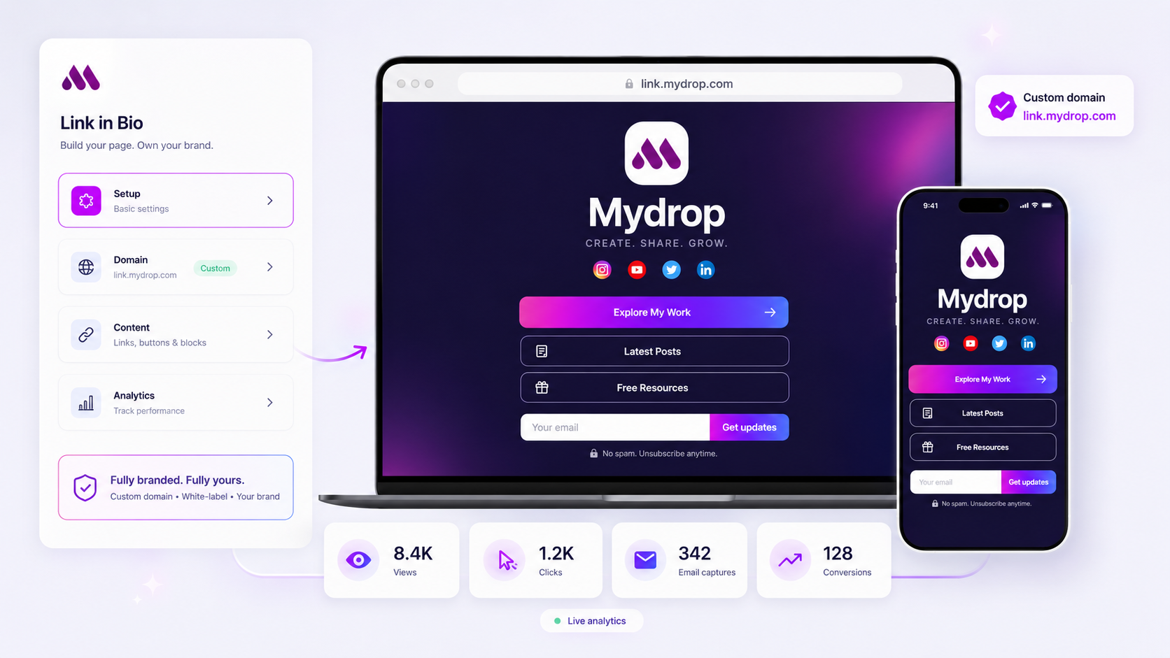
  1. Your own subdomain. links.yourbrand.com. It looks like your brand, it can be indexed, and it moves with you if you change tools. Connect this before you design anything.
  2. No vendor badge. A page advertising the tool it was built with looks temporary. White label is worth paying for, even when it sits on a higher tier.
  3. Brand basics, not a redesign. Logo, two colours and the brand's typeface if the tool allows it. Nobody ever converted because of a gradient.
  4. Editing that isn't a shared password. Two named editors, one reviewer and a record of what changed. The least disruptive way to do this is to run changes through the same approval step as a scheduled post, because your reviewer already has the habit.

The other half of a branded setup is keeping it current. A page that pulls in your latest posts and current featured product from wherever you already publish doesn't go stale between campaigns. That's the case for running it alongside your content calendar, not in a separate tool that only you remember to open.

What to track, and what to cut

Four numbers, every month:

Number What it tells you What to do
Views Whether the bio link is being tapped at all Low? Fix the bio text and the post CTA, not the page
Clicks per destination Which offer people want Promote the winner, cut the bottom two
Capture rate Whether the list is growing Under 2%? Move the capture higher or make the offer concrete
Source and UTM Which platform and campaign sent them Put more of the working post format back into the calendar

Views without clicks per destination is the number most tools give you, and it's the least useful of the four. If your tool can't break clicks down by link, that's a reason to change tools, before any design feature. Mydrop reports views, clicks, captures and conversions for each destination, right beside the performance data for the posts that drove them. That's what turns the page from a list of links into something you can improve.

Next step

Open your page and do the two-minute version now: count the links, cut anything with fewer than five clicks last month, and move the one action you really want to the top. Then set a monthly reminder to do it again.

Choosing the tool rather than fixing the page? Start with the 7 best link in bio tools for 2026, or team link in bio software if several people need to edit it.


Free tools

Free UTM Builder

Tag a link for every network at once, with tidy naming that GA4 reads properly.

FAQ

Quick answers

Give it one primary action and put that action on the first screen, with no scrolling needed. Order the other links by how ready the visitor is to buy, and cut anything that hasn't been clicked in a month.

Three to five. Every extra link splits attention and lowers the click rate on the one that matters. If you need more than five, you need a second page, not a longer list.

Put it on a subdomain like links.yourbrand.com, match the brand's fonts and colours, and remove the vendor badge. Then give two named people edit access, with a reviewer on changes, instead of sharing one password.

It varies far too much by audience and offer for a benchmark to help. Measure your own baseline for two weeks, then judge every change against that number, not against someone else's.

Send traffic to a proper landing page whenever there's a single offer. Use the bio page when visitors might want several different things and you don't know which.

Next step

Stop coordinating around the work

If your team spends more time chasing approvals, assets, and publish details than creating better posts, the problem is probably not your people. It is the workflow around them. Mydrop brings planning, review, scheduling, and performance into one calmer operating system.

Mydrop Editorial Team

About the author

Mydrop Editorial Team

Mydrop

The Mydrop Editorial Team writes the guides, comparisons, and playbooks on this blog. We cover social media planning, publishing, approvals, analytics, and multi-brand workflows, drawing on how teams actually use Mydrop to run their social programs. Every article is researched, edited, and maintained by the team behind the product.

View all articles by Mydrop Editorial Team

Managing 14+ social platforms felt like a 2 a.m. nightmare until Mydrop. The AI brand-voice mapping is scary accurate, and the client approval portal saved me easily 15 hours this week alone. It's the ultimate set-and-forget workspace for busy agencies.
A true automation tool for scheduling (and creating) social media content! It has saved me over 20 hours of work already in just my first couple weeks. A true game-changer for anyone in business, big or small!
Finally tried Mydrop on a test client and the white-label portal on a custom domain actually looks legit, no Mydrop branding sneaking in. The OAuth setup saved me from the usual “what's my password” back-and-forth.
Absolute game-changer. Mydrop completely automated my content workflow. The scheduling is flawless, it actually feels intuitive, and it saved me 10+ hours in my very first week. Best decision I've made for my socials!
Mydrop AI has been an absolute game changer, it has saved me so much time and effort. It does what it promises. Easy to use, versatile, and the creator is really open to feedback. Very happy!
I was looking through a bunch of management tools for my client, as it was getting out of control; after comparing every solution, I found Mydrop to be a no brainer.
This app helps me more than any other I have ever used. I've got all of my pages and accounts and I can drag and drop like I want. Mydrop has really been a huge asset to my business!
I was looking for a scheduling tool as my clients were using more and more platforms. Mydrop does the job very well, and automations and forms are very useful and save me a lot of time. I recommend!
Love that you baked in white-label portals from day one, that's a huge pain point for agencies.
Love this platform for scheduling social media posts! Easy and very intuitive to use! Highly recommend!
Very nice tool, you will save a lot of time. Very easy to use, user friendly. I have used it for several months and it is very helpful.
Helpful app if you are trying to streamline social content creation for clients.
Managing 14+ social platforms felt like a 2 a.m. nightmare until Mydrop. The AI brand-voice mapping is scary accurate, and the client approval portal saved me easily 15 hours this week alone. It's the ultimate set-and-forget workspace for busy agencies.
A true automation tool for scheduling (and creating) social media content! It has saved me over 20 hours of work already in just my first couple weeks. A true game-changer for anyone in business, big or small!
Finally tried Mydrop on a test client and the white-label portal on a custom domain actually looks legit, no Mydrop branding sneaking in. The OAuth setup saved me from the usual “what's my password” back-and-forth.
Absolute game-changer. Mydrop completely automated my content workflow. The scheduling is flawless, it actually feels intuitive, and it saved me 10+ hours in my very first week. Best decision I've made for my socials!
Mydrop AI has been an absolute game changer, it has saved me so much time and effort. It does what it promises. Easy to use, versatile, and the creator is really open to feedback. Very happy!
I was looking through a bunch of management tools for my client, as it was getting out of control; after comparing every solution, I found Mydrop to be a no brainer.
This app helps me more than any other I have ever used. I've got all of my pages and accounts and I can drag and drop like I want. Mydrop has really been a huge asset to my business!
I was looking for a scheduling tool as my clients were using more and more platforms. Mydrop does the job very well, and automations and forms are very useful and save me a lot of time. I recommend!
Love that you baked in white-label portals from day one, that's a huge pain point for agencies.
Love this platform for scheduling social media posts! Easy and very intuitive to use! Highly recommend!
Very nice tool, you will save a lot of time. Very easy to use, user friendly. I have used it for several months and it is very helpful.
Helpful app if you are trying to streamline social content creation for clients.
Smiling social media managerSmiling social media managerSmiling social media managerSmiling social media managerSmiling social media managerSmiling social media manager

4.8/5 · on Trustpilot & Google