
Shallow reporting happens when you hand over data without context. If your stakeholders are asking "So what?" every time you hit send, you are providing a raw data dump, not a report. To move from noise to signal, you must audit the bridge between your raw metrics and your executive summary. Your team is likely drowning in rows of numbers, yet starving for the story behind why those numbers moved.
We get it. You spent days pulling data, cleaning charts, and formatting PDFs, only to have a senior stakeholder scan the deck and ask for "more depth." That specific frustration-the gap between your effort and their perception-is a massive morale killer. You are not failing the data; you are failing the narrative synthesis. The awkward truth is that more granularity often obscures the truth. Executives do not need a spreadsheet of every single post; they need a story about why the engagement trend shifted last Tuesday.
What changed before the numbers moved

When a report feels shallow, it is rarely because the metrics are wrong. It is because the report lacks a causal link between the content strategy and the business outcome. We often see teams fixate on surface-level vanity metrics-like total impressions-while ignoring the qualitative "messy middle" that actually explains performance.
In our experience, the disconnect starts the moment you stop treating a report as a document and start treating it as a deliverable package. If your workflow requires you to export raw numbers and then manually construct a narrative in a separate tool, you have already lost the context. By the time you annotate the charts, the original reasoning has often evaporated.
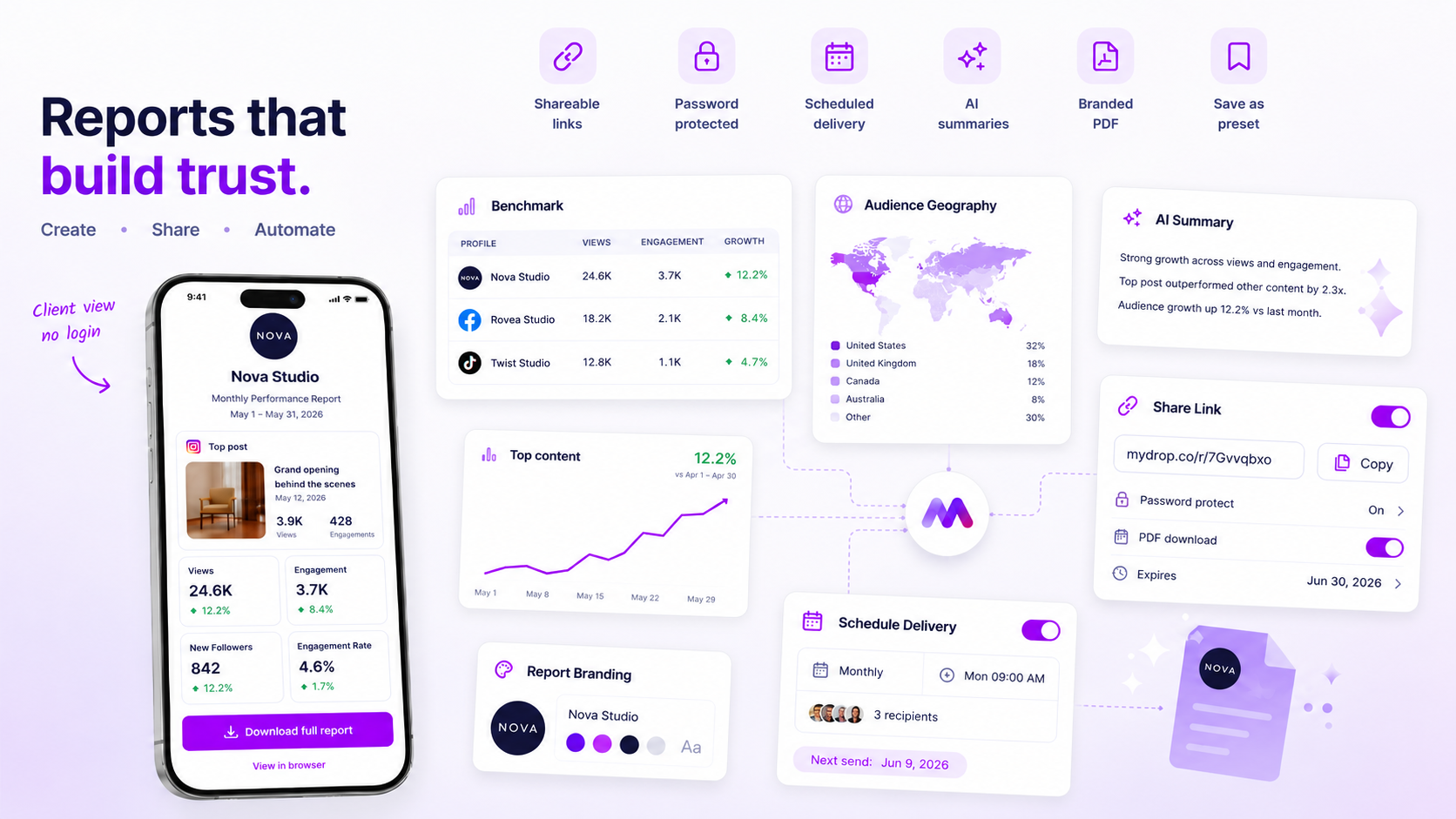
At Mydrop, we designed our report builder to prevent this by forcing a synthesis step alongside the data. Instead of just showing a bar chart, the workflow embeds the specific post-level evidence-the actual content that triggered the spike-directly into the report.
Here is a simple audit to see if your reports are hitting the mark or just adding to the inbox noise.
| Diagnostic Checkpoint | The "Shallow" Pattern | The "Deep" Standard |
|---|---|---|
| Metric Selection | Reporting on vanity volume (Likes, reach) | Reporting on outcome KPIs (Conversion, share of voice) |
| Evidence Basis | Charts standing alone without context | Every major chart linked to specific post examples |
| Narrative Depth | "Impressions are up 10%" | "Impressions are up 10% because of the new video series" |
| Configuration | Static "last 30 days" for everyone | Tailored presets for different stakeholder roles |
| Synthesis Method | Manual interpretation after export | AI-assisted narrative summary generated with data |
Operator rule: If a stakeholder has to ask "So what?" about any chart in your report, that chart should be removed or paired with an explicit, human-written (or AI-synthesized) observation of the why.
Most teams do not have a data shortage; they have a coordination debt that makes gathering evidence too expensive to do on every cycle. If you can automate the inclusion of evidence, you stop spending your time formatting and start spending it on the strategy.
The failure patterns to check first

We have seen this across dozens of agencies and enterprise teams: the reporting process turns into a game of "hide the data." When a report lands on a stakeholder's desk and feels shallow, it is usually because the report was built for breadth-trying to show everything to prove that work actually happened-rather than depth, which requires proving that the work actually mattered.
Here are the four common patterns that turn a solid analytical effort into a data dump that gets ignored:
- The Vanity Metric Trap: You are reporting on total reach or aggregate followers when the business is actually tracking conversion, lead quality, or brand sentiment shift. If your metrics don't align with the quarterly business goals, the report is essentially white noise.
- Context-Free Charts: A graph showing a 15% spike in engagement is just a line on a page. Without the accompanying context-like the fact that you shifted to a video-first format for that specific product launch-your stakeholder is forced to play guessing games.
- The "One Size Fits All" Presumption: You are sending the exact same monthly PDF to the CMO as you are to the Social Media Coordinator. The CMO needs the executive-level narrative; the coordinator needs the post-level drill-down.
- Static Snapshotting: Using a rigid, manual spreadsheet to track performance instead of a dynamic, living report. When you spend three hours manually formatting cells every Friday, you lose the ability to actually think about what those numbers are telling you.
At Mydrop, we designed the Analytics Report Builder to force a synthesis step. By integrating AI-driven summaries alongside your charts, the tool forces you to pair the "what" with the "why." It turns the report from a spreadsheet into a conversation.
The proof that separates signal from noise
The difference between a shallow report and a high-stakes deliverable comes down to one simple rule: Does every visual insight have a corresponding narrative anchor?
If you have a chart, you must have an explanation. If you have an explanation, you must have the post-level evidence to back it up. If you are missing one of these, you are leaving your stakeholders with unanswered questions.
Use this Report Health Scorecard to audit your next draft before you hit "Send."
| Component | Goal | Shallow Check (Fail) | Deep Check (Pass) |
|---|---|---|---|
| KPI Alignment | Defend budget | Lists metrics in a vacuum | Connects metrics to business outcomes |
| Narrative Synthesis | Explain "So What?" | No summary or "AI-generated" filler | Human-validated AI insight explaining the trend |
| Evidence Layer | Prove strategy | Charts only, no post links | Includes specific post links as "evidence" |
| Branding | Professionalism | Raw platform CSV export | Unified template with brand colors/logo |
| Tailored View | Executive focus | Full-feed overview for everyone | Role-specific dashboard or preset |
Decision check: If a stakeholder has to ask "So what happened here?" while looking at a chart, your report failed the audit.
Most teams struggle because they are building reports from scratch every single time, which leads to configuration fatigue. You end up defaulting to the standard platform export because you are too exhausted to customize the narrative. This is why we advocate for reusable templates.
When you use a template that already has the correct branding, metric selection, and AI summary modules locked in, you stop fighting the tool and start focusing on the actual analysis. You move from being a data reporter to being a strategist. The real goal is to spend less time formatting and more time deciding what to do next.
What to fix this week
If you are currently drowning in a sea of raw data, stop. Take thirty minutes to perform a simple "report audit" on your next deliverable. You do not need a complete overhaul to get immediate breathing room. Instead, start by mapping your existing metrics against the Context-First principle.
Does every chart serve a specific business question? If a metric cannot explain why a trend shifted or what it means for the upcoming quarter, pull it from the final view. We often find that removing 50% of your charts actually doubles the perceived quality of the report because it forces you to focus on the narrative core.
Workflow check: If a stakeholder has to ask "So what?" more than once per report, you have a signal problem, not a data problem.
Here is a simple checklist to run through before you hit export:
- The Evidence Gap: Do you have at least one specific post or piece of content linked to every major spike or drop in performance?
- The Narrative Sync: Is there a written summary-either manually drafted or generated via an AI tool-that frames the data?
- The Brand Check: Does the report look like it belongs to your brand, or does it look like a generic export from a third-party tool?
- The Audience Alignment: Are you showing the same metrics to the VP of Marketing that you show to the social team? If so, split the presets today.
At Mydrop, we designed the Analytics Report Builder specifically to force this synthesis. It prevents the "data dump" by prompting you to select sections and AI-driven insights alongside the raw metrics, ensuring your final deliverable is an argument, not just a spreadsheet.
When to stop diagnosing and change the workflow
There is a point where manual report building becomes a liability. If your team is spending more than four hours a week formatting PDFs, shifting columns in spreadsheets, or re-applying branding to recurring reports, you are not suffering from a "reporting problem." You are suffering from coordination debt.
When you hit the limit of what manual labor can support, stop tweaking the spreadsheets. It is time to move to a template-based model.
| Manual Workflow | Template-Based Workflow |
|---|---|
| Pull data for each brand individually | Apply preset template to all selected profiles |
| Manually format PDF colors and logos | Inherited branding from saved snapshots |
| Write unique executive summaries every time | Use AI narrative panels as a starting point |
| Ad-hoc metric selection per request | Standardized metric presets by stakeholder level |
The transition is straightforward: create one high-quality report configuration that actually hits the mark, save it as a Report Template, and lock that in as your standard operating procedure. Once you have a reusable preset, your work shifts from "building a report" to "reviewing the narrative."
Conclusion
The pressure to prove the value of social media is real, but the way out isn't by adding more rows to your spreadsheet. It is by shifting the focus from the quantity of the data to the quality of the narrative.
When you present evidence instead of noise, you aren't just reporting on the last thirty days-you are helping your stakeholders make better decisions for the next ninety. That is how you move from being a cost center to a strategic partner. Stop chasing the data and start owning the story. Your stakeholders, and your own sanity, will thank you.