
The best way to fix your client reporting isn't to build a better spreadsheet, but to stop treating every report as a bespoke craft project. You need to transition from manual, one-off assembly to a template-first production line. By defining your branding, metric sets, and AI summary preferences once in a reusable preset, you eliminate the weekly scramble to find last month's file, copy the formulas, and hope you remembered to update every client logo in the header.
We have all been there. It is Friday afternoon, the team is exhausted, and you are staring at five different versions of the same report format. You are terrified of leaving the wrong client’s name on a cover sheet. It feels like you are doing "high-touch" service, but you are really just paying a heavy tax on administrative busywork. The goal is to move your brain-space from formatting cells to actually analyzing what those numbers mean for the client’s growth.
Where the handoff is actually breaking

Most reporting friction stems from a subtle misconception: the idea that every client needs a totally unique structure to feel "valued." In reality, clients value accuracy, speed, and clear narrative insight-none of which require you to spend hours manually aligning charts or color-coding headers every week.
Here is where teams usually get stuck. You are likely treating the report as a final destination, rather than an automated output of your strategy. When your team has to rebuild the branding-logo, footer, and font settings-for every single run, you create an operational bottleneck that guarantees inconsistencies. If you are touching a settings menu more than once a month, you are likely working harder, not smarter.
To get a clearer picture of your current efficiency, we often look at how much of the work is actually "repeatable" versus "bespoke."
| Activity | The "Custom-Every-Time" Trap | The "Preset-First" Model |
|---|---|---|
| Branding Setup | Manual logo, font, and color choice per run. | Saved branding profile applied globally. |
| Metric Selection | Copy-pasting data from raw exports. | Pre-defined metric templates per client type. |
| AI Narrative | Writing manual summaries from scratch. | Automated, AI-generated summary panels. |
| Consistency | High risk of "previous client" ghost data. | Locked-in structure for every brand. |
| Time per Report | 60 to 90 minutes. | 5 to 10 minutes for verification. |
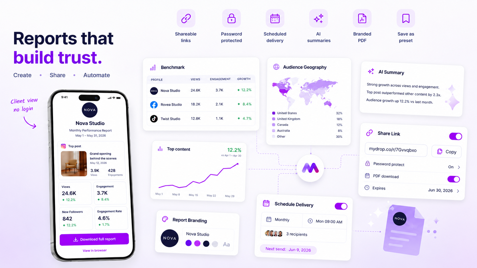
When you support dozens of brand profiles, this isn't just a minor annoyance; it is a systemic failure of your workflow. At Mydrop, we see teams solve this by using the Analytics Report Builder to convert those manual, error-prone steps into a single, durable package. Instead of re-creating the wheel, you build a "Monthly Executive View" template once, and then apply it across your entire client roster.
Operator rule: If you find yourself manually checking if a footer, logo, or contact email matches the client, your process is not yet a system. It is still a manual chore.
The shift is simple: stop manually configuring the "what" and start automating the "how."
The coordination fatigue checklist

If your weekly reporting cycle feels like a high-stakes scavenger hunt, you are likely burning through your team's best energy on admin, not strategy. Before you try to reorganize your workflow, perform this quick audit to see if you are operating on a solid foundation or just patching leaks in a sinking boat.
Check your current process against these common failure modes:
| Failure Mode | The Warning Sign |
|---|---|
| Bespoke Logic | You maintain a unique "master file" for each client instead of using shared presets. |
| Manual Formatting | You spend more than 15 minutes per report aligning logos, font sizes, or color hex codes. |
| Context Friction | You have to manually re-gather the same metrics every week because you cannot save your configuration. |
| Narrative Vacuum | You deliver raw data without context, forcing the client to do their own "so what" analysis. |
| Data Silos | You pull stats from three different native platform dashboards just to get a single cross-channel view. |
If you hit three or more of these markers, you are not really building reports-you are doing manual data entry that happens to look professional. Standardization is not a loss of creativity; it is the act of reclaiming the time you need to actually think about the results.
How to move decisions closer to the work
Most teams try to solve reporting pain by hiring more analysts or adding more layers of review. This almost always backfires. Instead, move the decision-making process into your template. By locking in your definitions for "success" at the start, you stop negotiating branding and metrics every single Friday.
Start by treating your reporting structure as a product. At Mydrop, we see the most successful agencies define a Core Performance Preset that every account manager uses as their starting point.
Decision check: If a metric, section, or branding element is used in more than one report, it belongs in a template. No exceptions.
Here is how to shift your team from manual assembly to a repeatable pipeline:
- Define your "Default View": Audit the last three months of reports. Extract the three sections every client actually reads-usually engagement trends, post-performance highlights, and a high-level summary. That is your template base.
- Centralize the branding: Stop asking designers for logo files or hex codes. Store your brand assets in a shared library where the reporting engine pulls them automatically. If the branding is hardcoded into the setup, you remove the risk of sending the wrong logo to a client.
- Automate the "So What?": Stop delivering raw numbers alone. Use tools that bake AI-driven narrative summaries into your reports, turning raw data into an immediate, human-readable takeaway.
- Adopt a "Generate-First" cadence: Never build a report from scratch. Open your saved preset, update the date range, add specific posts for the period, and hit generate. If the report needs a tweak, edit the template, not the individual PDF.
By moving these decisions into a preset, you turn a tedious manual task into a simple verification step. Your goal is to get to a point where your weekly "reporting" consists of scanning a pre-generated, branded PDF for accuracy, not spending four hours wrestling with charts. When you stop touching the layout, you finally have the bandwidth to discuss the actual outcomes.
The roles and rules that reduce rework
The fastest way to kill a reporting cycle is to let every stakeholder treat the metrics like a blank canvas. When someone asks to "just change the font" or "tweak this chart slightly," you are not being helpful; you are inviting a death by a thousand cuts. The most successful teams we see establish a Standardized Reporting Charter. This is not a formal policy document, but a simple set of ground rules that everyone agrees to before the quarter starts.
The core rule is simple: Decision once, execution always. If a metric or a section of the report requires a manual explanation, that explanation belongs in the template itself, not the weekly delivery.
Workflow check: If you touch a report setting more than twice a month, it is no longer a task; it is a template requirement.
Define who is responsible for the branding snapshot-the logo, the specific accent colors, and the footer contact info. When this is locked into a reusable preset, your team stops hunting for high-res logo files and starts focusing on what the data actually says. We have seen hundreds of brand profiles managed this way; the teams that stop the manual hunt are the ones that actually have time to think about strategy.
The weekly habit that keeps the system honest
You need a cadence that prevents the work from sliding into a Friday afternoon panic. We recommend a Generate and Verify flow. This moves the bulk of the heavy lifting to a single, automated step, leaving your team with only the final polish.
- Preset Trigger: At the start of the reporting period, apply your saved template. This instantly pulls the correct metrics, date ranges, and brand assets for that specific client.
- Narrative Synthesis: Use automated summaries to generate a first draft of the highlights. This gives you a baseline to review rather than a blank page.
- Evidence Audit: Scan the post list to ensure the most relevant content is surfaced. If a key campaign post is missing, drag and drop it in.
- One-Click Export: Generate the final PDF. By keeping the branding and layout fixed in your template, you ensure the output is ready to send the second the PDF finishes rendering.
| Activity | The "Custom-Every-Time" Trap | The "Preset-First" Model |
|---|---|---|
| Setup time | 60-90 minutes | 5-10 minutes |
| Brand consistency | High risk of error | Zero variance |
| Mental tax | High (context switching) | Low (verification only) |
| PDF production | Manual assembly | Instant generate |
If you find yourself manually taking screenshots, stop. You are creating a brittle output that breaks the moment a platform changes its dashboard layout. Mydrop’s Report Builder works by treating the report as a durable package, not a temporary view. When you save a template, you are saving your team from the repetitive manual configuration that eventually burns out your best talent.
Conclusion
Standardizing how you report is the best way to prove your team’s value. When you stop acting like a glorified administrative assistant tasked with manual data entry and start acting like a production line operator, the results change. You aren't just delivering a document; you are providing a consistent, reliable signal to your stakeholders.
The goal isn't to make reports "easier." The goal is to make them invisible. When the reporting process becomes an automatic output of your weekly rhythm, it stops being a burden that sits on your calendar and becomes a tool that helps you win the next campaign. Stop building reports from scratch. Save your presets, lock in your branding, and reclaim your Fridays. Your team’s focus is your most finite resource; don't spend it on aligning charts.