
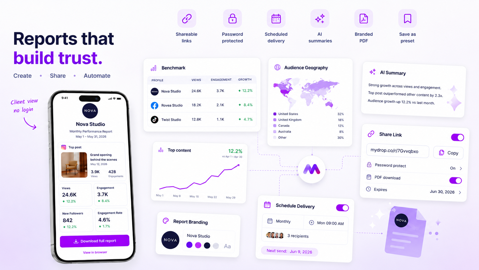
Stop rebuilding your client reports from scratch every week. If you are manually re-aligning logos, hunting for the right metrics, and rewriting executive summaries for every single account, you are not reporting. You are performing expensive administrative labor that actively distracts your team from actual strategy.
We get it. It is Thursday afternoon, the client email is looming, and you are stuck in a spreadsheet nightmare trying to make charts look professional. It is messy, repetitive, and frankly, the primary driver of agency burnout. The good news is that you can move from manual construction to a repeatable reporting cadence where every PDF is client-ready without a single pixel-pushing session.
The operating problem this solves
The core issue here is the Customization Trap. Many agencies operate under the false assumption that unique reports require manual effort. You treat each report as a bespoke creative project rather than a standardized product. When you copy-paste data, you are essentially treating your team like a manual data pipeline, which is a massive drain on your margins.
Most reporting workflows break down because they confuse design with data. They are two completely different jobs, yet we force them to happen simultaneously at the eleventh hour.
Operator rule: If your reporting process requires more than five minutes of manual formatting, you are paying for administrative overhead, not performance insights.
To stop this, you need to decouple the brand identity from the data source. When you build a template-defining the colors, the specific metric layouts, and the AI narrative structure-you create a preset. Once that preset is saved, the "rebuild" becomes a background task.
Here is where teams usually get stuck when trying to scale their output:
| Diagnostic Area | The Manual Bottleneck | The Scalable Approach |
|---|---|---|
| Branding | Re-uploading logos/fonts every time | Stored branding snapshots |
| Metric Selection | Selecting and re-ordering charts | Reusable report templates |
| Synthesis | Writing summaries by hand | Automated AI narrative |
| Delivery | Manual PDF export and mail | Scheduled automated delivery |
At Mydrop, we see agencies managing dozens of brand profiles struggle precisely because they lack this separation. They try to "build a report" instead of "running a template." This is the part people underestimate: clients value the consistency of a high-quality PDF arriving at the same time every week far more than they value a custom-colored border that you spent an hour adjusting.
The goal is to stop being a "reporting shop" and start being an "analysis shop." You want your team spending their Friday morning discussing trends with the client, not fighting with a layout engine.
The minimum system that works

You stop the manual rebuild cycle by decoupling your branding from your data collection. The goal isn't to build a better report; it is to build a better product that happens to be a report.
When you use the Mydrop Analytics Report Builder to save a preset, you are effectively baking your team’s institutional knowledge into a reusable artifact. You define the profiles, the specific metrics that matter to that client, and the visual identity once. From then on, generating the next deliverable is just a matter of refreshing the data, not re-constructing the document.
Decision check: A report is only a system if it can be generated by someone who did not perform the underlying analysis. If your "lead strategist" is the only person who knows which columns to hide or which logo version to use, you have a bottleneck, not a process.
Here is the quick audit we use to see if a reporting workflow is actually stable:
| Audit Point | The Manual "Silo" Sign | The System "Product" Sign |
|---|---|---|
| Branding | Manual upload/re-alignment | Global branding snapshot |
| Data Scope | Ad-hoc profile selection | Stored profile/group preset |
| Narrative | Rewrite from scratch each time | AI-assisted summary integration |
| Delivery | Emailing static file attachments | Direct PDF generation/delivery |
If your team is still spending Friday afternoons on the "Manual Silo" side of that table, you are trading expensive talent for cheap labor.
Where teams overbuild the process
The most common trap we see in enterprise agencies is the "Kitchen Sink" report. Somewhere along the line, a stakeholder asked for a metric they didn't really understand, so the team added it. Then they added another. Before long, you are shipping 40-page PDFs that no one reads, filled with metrics that don't actually inform a single business decision.
Overbuilding happens when you confuse data density with data clarity.
Most clients do not need to see every single platform interaction. They need to see the signal in the noise. When you include every possible chart, you are essentially asking your client to do your job for you-they have to hunt for the insights that actually matter.
In our experience, teams managing dozens of brands usually fall into the "fluff" trap because they are afraid to say no to requests. If a client wants to see "all the things," you have a governance problem, not a reporting problem.
The simple fix:
- Audit your current template: If a metric hasn't been referenced in a client meeting in the last 90 days, delete it.
- Focus on outcomes: Swap out granular "vanity" metrics for high-level summaries and clear post-evidence that ties social performance to broader brand goals.
- Standardize the "Summary" block: Use the AI-assisted summaries to provide the narrative layer. Let the data support the story, not replace it.
When you strip away the filler, you don't just save time. You actually make your reports more influential because your clients start paying attention to the few things that you are actually presenting as actionable. It is easier to defend a focused report than to explain why a massive, bloated one is missing a specific detail.
How to run the cadence
Getting your reporting system to run on autopilot is only half the battle. The other half is ensuring you actually read the output. We have seen too many teams build a flawless automated pipeline only to let the resulting PDFs gather digital dust because no one carved out the time to review them.
To break the cycle of "reacting to metrics" and move into "proactive strategy," you need a locked-in cadence. Stop treating the end-of-month report as a task that gets pushed to the next available opening. Treat it like a client meeting-non-negotiable and time-blocked.
Here is a simple, repeatable cycle to integrate into your Friday workflow:
- Wednesday (The Data Refresh): Log in, apply your "Agency Standard" template to your core accounts, and trigger the report generation. This keeps you from rushing on Friday afternoon.
- Thursday (The Narrative Pass): Quickly review the AI-assisted summaries. Add your own brief notes or highlight specific posts that outperformed.
- Friday (The Strategy Sync): Export the final PDF. Spend 15 minutes reviewing the performance against your goals. If a metric is flat, decide on one actionable tweak for next week.
By separating the "data gathering" (Wednesday) from the "strategy reflection" (Friday), you stop the frantic, last-minute rush that kills creative thinking.
Workflow check: Never review analytics and write strategy in the same sitting. Your brain is not equipped to be a data-processor and a storyteller at the same time.
The proof that the habit is working
How do you know you have successfully conquered your coordination debt? It is not about a fancy dashboard or hitting a specific reach number. It is about the friction you no longer feel.
When your reporting habit is truly working, you will notice these three shifts in your weekly rhythm:
| Indicator | The Manual "Before" | The Automated "After" |
|---|---|---|
| PDF Time | 2 to 4 hours per client | Less than 5 minutes |
| Feedback Loop | Waiting on design/branding tweaks | Instant, template-backed consistency |
| Strategy Quality | "What happened?" (Descriptive) | "Why did it work?" (Analytical) |
If you find yourself opening a blank presentation slide to "format the charts" for a new client, you are back in the trap. The goal is to reach a state where the report is a byproduct of your work, not a project in itself. If you can walk away from your desk on a Friday knowing your clients are updated, you have reclaimed your most valuable asset: your time.
Conclusion
Reporting is not a creative hurdle. It is a communication tool. The moment you stop treating it like a design project and start treating it like a recurring service, your stress levels will drop, and your clients will actually start getting the insights they pay for.
You are not paid to copy and paste numbers into boxes. You are paid to understand what those numbers mean for the business. Use the tools you have to automate the heavy lifting, keep your branding consistent without the manual labor, and spend your Friday afternoon actually improving the strategy rather than chasing pixels. Your next campaign week will thank you.