
The most successful agencies stop treating every client report as a custom project and start treating them as a repeatable product. By moving from manual, one-off spreadsheet assembly to stored, durable report runs and templates, you replace hours of fragmented data gathering with a "set-it-and-forget-it" workflow that delivers client-ready insights in minutes.
We get it. The end of the month is a gauntlet of chasing fragmented screenshots, agonizing over late-night formatting, and the nagging fear that you are showing the wrong data to the wrong stakeholder. You are working hard, but the reporting process feels like it is held together by duct tape. It is exhausting, and worse, it keeps your best people from doing the high-level strategy that actually wins renewals.
The operating problem this solves

Most teams think their reporting problem is a design issue, or that they just need a better tool for building pretty charts. They are looking for a magic bullet for layout, but the real cost is hidden in coordination debt.
When every team member interprets metrics differently and builds unique layouts from scratch, you create an internal bottleneck where quality control becomes impossible. Your clients eventually notice the inconsistency, too-one month they get a PDF with five charts, the next month they get three different ones, and the brand identity fluctuates. This isn't just "messy"; it is a sign that your reporting lacks an infrastructure.
Here is where teams usually get stuck:
| Reporting Maturity | Workflow Method | Primary Pain | Scalability |
|---|---|---|---|
| Fragmented | Screenshots in PPT/Slides | High manual effort, no data history | Zero |
| Centralized | Custom Excel/Sheet exports | Data silos, inconsistent logic | Low |
| Operationalized | Stored Templates & Preset Runs | None; automated, branded, repeatable | High |
Common mistake: Over-customizing for individual clients when 80% of their data needs are identical. You do not need a bespoke, hand-crafted report for every single brand; you need a standard "baseline" that you can augment with specific narrative summaries where they add actual value.
In our experience, the transition from manual to automated isn't about ditching the personal touch-it is about removing the friction so you can actually afford the time to provide that touch. If you are rebuilding a metric layout more than once, you need a template, not a new spreadsheet.
Operator rule: If your reporting process requires a "master document" that you copy and paste into every month, you have already lost the battle against coordination debt. Shift that logic into a template that generates the report for you.
When reporting is treated as a product, you shift the focus from data collection to data storytelling. Your team stops being a group of data-entry clerks and starts acting like the advisors your clients are paying for.
The minimum system that works

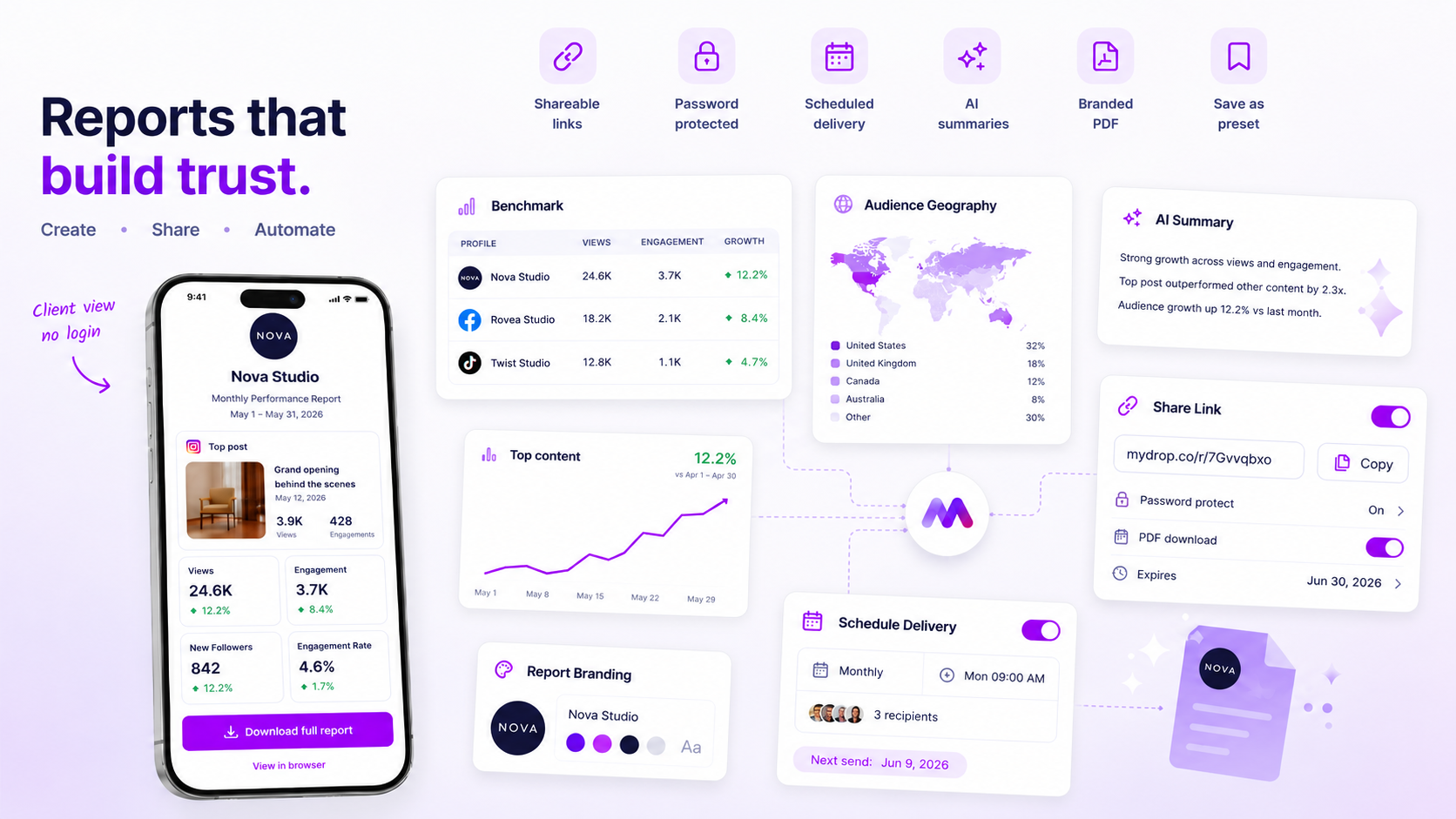
The secret to sane reporting is simple: stop building, start curating. A durable report system is built on the same logic as a well-oiled publishing calendar. It requires three non-negotiable components: a consistent data backbone, a set of reusable branded presets, and an automated narrative layer.
If your reports take longer than ten minutes to generate, it is not because you lack data. It is because you are manually re-assembling the same structure every single time the calendar turns.
| Maturity Stage | Workflow | Reliability | Primary Pain Point |
|---|---|---|---|
| 1. Fragmented | Manual screenshots in slides/Excel. | Low: High human error. | Constant "where did this number come from?" questions. |
| 2. Aggregated | Raw CSV exports, pivot tables. | Medium: Slow but stable. | Data isolation; no context for the client. |
| 3. Operationalized | Stored templates with AI summaries. | High: Immediate and consistent. | Transitioning legacy habits to the new system. |
At Mydrop, we see teams move from stage one to three by focusing on template-driven snapshots. Instead of chasing a new dashboard layout, you define the metric set, brand colors, and section order once. When it is time to report, you apply that template. The result is a consistent "delivery package" that stakeholders can actually read, rather than a cryptic, custom-built spreadsheet that only you understand.
Where teams overbuild the process
Here is where teams usually get stuck: they fall in love with hyper-customization. They believe that if a client's report looks 100% unique, the client will feel more valued.
The reality? Your client does not want a unique design. They want predictable insights.
When you overbuild, you create a massive maintenance liability. Every new metric added to one client's report is a prompt for every other client to ask for the same. You inadvertently build a coordination bottleneck that consumes your team's best hours.
Decision check: If you are rebuilding a layout more than once, it is a template, not a custom job.
Limit your custom elements to the "Strategy" or "Executive Summary" sections. Everything else-from engagement trends to top-performing posts-should be standardized across every profile you manage. A report that takes two hours of "design time" is not better than one that takes two minutes; it is just more expensive.
If you are fighting to keep your reporting consistent, you are likely suffering from template drift. Stop trying to make every report a work of art and start making them reliable commodities. Your team will thank you, and your clients will appreciate getting their data on the first of the month, every single month, without fail.
How to run the cadence
The biggest mistake teams make is treating the end-of-month reporting cycle as a massive, one-time data migration project. You don't need a project; you need a pulse. Once your template is locked in Mydrop, shift your workflow to an automated "Generate and Distribute" rhythm.
Stop asking your team to "put together the report." Instead, assign a "Report Reviewer" who simply triggers the existing preset for the new month, verifies the AI-generated summaries for tone, and exports the final deliverable.
Workflow check: If a human spends more than 15 minutes assembling an analytics report, you have a broken template or a tool failure.
To keep this running smoothly, follow this simple audit before you hit "Generate" on any monthly run:
- Verify the Scope: Ensure your profile and group selections haven't drifted. Did you add new market channels? Are old profiles retired?
- Date Alignment: Double-check that your date preset (like
lastMonth) correctly aligns with your client's fiscal calendar. - Narrative Check: The AI summary is your safety net, not your entire brain. Read the summary for logical consistency. Does the data trend match the actual campaign outcomes your team knows about?
- Evidence Audit: Scan the included post list. Are the top performers actually representative of the strategy, or did one fluke post skew the metrics?
- Branding Refresh: Ensure the logo, prepared-by identity, and theme colors still match the current client brand guidelines.
This cadence turns the most stressful day of the month into a 10-minute sanity check. By the time the client opens their PDF, the work is done, the data is locked, and the branding is consistent.
The proof that the habit is working
You know your standardization efforts are working when the "reporting conversation" with your stakeholders shifts entirely.
When you move from manual, inconsistent snapshots to branded, template-driven PDF reports, the feedback loop changes from What does this data mean? to What should we do next?
| Metric | Before (Fragmented) | After (Operationalized) |
|---|---|---|
| Data Assembly Time | 4-8 hours per client | < 15 minutes per client |
| Client Feedback | "Where did this metric come from?" | "How do we scale this winning post?" |
| Visual Consistency | High variance (Excel vs. Canva) | Unified (Brand-matched PDF) |
| Stakeholder Trust | Low (Suspects "best-case" selection) | High (Data is durable and audit-ready) |
The real victory is the death of the "coordination debt." When every stakeholder sees the same metrics, in the same order, with the same branding, you no longer waste time explaining why the "social engagement" chart looks different this month than it did in the last quarter. You’ve replaced ambiguity with a repeatable product.
Conclusion
Standardizing your analytics isn't just about making things look pretty. It is about protecting your team's most valuable asset: their time.
When you shift from manual assembly to a system of durable, templated reports, you aren't just filing paperwork. You are building a conduit for clear strategy. The goal is to reach a point where your analytics reports are simply the predictable output of your team’s hard work, delivered automatically, reliably, and beautifully.
Stop the screenshot cycle today. Pick one core client, build the template in the Mydrop Report Builder, and see how much time that first automated run gives back to your week. Your team will thank you, and your clients will finally have the clarity they actually need.