The best social media reporting software is one that eliminates the manual grind of assembling client-ready insights. If your team is still spending hours every Friday copying screenshots and manually crunching numbers in a slide deck, you are not scaling your agency, you are inflating your overhead. The goal is not just better charts, but a reliable reporting operating system that turns raw analytics into a branded, automated deliverable.
We have all lived the Friday afternoon crunch, hunting for performance data across platforms, scrambling to fix broken formulas, and hoping the final PDF actually looks like your brand, not a generic dump of numbers. It drains your best strategists, introduces unnecessary risk, and turns a valuable conversation into a chore.
What the best tools need to handle

When you are managing dozens of brand profiles across multiple markets, your reporting tool needs to move from a viewer to a production machine.
Most basic dashboards break down because they force a human to re-create the same setup for every client. If you have to manually select the profiles, re-pick the metrics, and re-apply your branding every month, you are not managing social; you are managing a spreadsheet with a nicer UI.
Here is the threshold for tools that actually support scaling:
| Feature | Why it matters for scale | The Manual Tax Risk |
|---|---|---|
| Reusable Templates | One-click application of brand-specific metric sets. | Re-creating every report from scratch wastes ~2hrs/month per client. |
| Branded PDF Control | Client-ready outputs that match your agency’s style. | Using default PDF exports makes your brand look disorganized to clients. |
| AI Narrative Synthesis | Instantly summarizes performance patterns and the why behind the data. | Without context, data is just noise; manually writing summaries is a massive bottleneck. |
| Multi-Profile Grouping | Aggregate insights for complex brand structures in one pass. | Siloed data forces manual aggregation and increases margin for math errors. |
Operator rule: If your reporting software requires a human to assemble the report, you have already lost the efficiency battle. Software should generate the package; humans should narrate the outcome.
Beyond just checkboxes, you need stability. If a tool requires constant re-hydration of data or fails to reliably generate a branded PDF because a connection dropped, your team is right back to manual workarounds. Look for platforms that treat the report as a durable asset, a documented snapshot of performance you can revisit later, rather than just a transient browser view.
When you shift to a template-first mindset, the conversation with your client changes. Instead of explaining where the data came from, you get to spend your time explaining what it means for their business. That is the difference between being a vendor and being a partner.
Where basic tools start to break

The trap isn't that you lack data. It is that you are drowning in it, but none of it is actually useful to your clients. Most generic dashboards are fine for a quick gut check, but they break the moment you need to tell a story across five different brands, ten channels, and a custom date range.
When you rely on spreadsheets, screenshots, and manual slide deck creation, you hit a hard wall. This is the "Too Much CSV, Not Enough Insight" trap. Your team spends six hours on a Friday just formatting numbers, leaving zero time to actually interpret what they mean.
This is a massive operational leak. Every hour spent copy-pasting is an hour not spent on strategy. Worse, the "manual tax" introduces risks you can't afford. A single copy-paste error in a client's growth percentage isn't just embarrassing; it erodes trust. When your team is burnt out from fighting the software, the quality of your reporting-and the insights within it-inevitably suffers.
Common mistake: Treating reports as a snapshot you build once, rather than a repeatable package. If you find yourself hunting for last month's chart structure in a shared drive, you aren't scaling.
The buying criteria that matter
To break the cycle, you need software that understands that reporting is a product, not a task. When you are evaluating your next move, don't look at the number of chart types. Look at the workflow.
Here is the reality: at scale, you need a reporting engine, not a visualization gallery. If the tool forces a human to manually "assemble" the report, you have already lost the efficiency battle. Software should generate the package; humans should narrate the outcome.
At Mydrop, we see this constantly: the teams that thrive are the ones that shift their mindset from "building reports" to "configuring report products." You need tools that handle multi-profile grouping effortlessly and, crucially, offer AI narrative synthesis to turn that raw data into actual findings before a human even opens the file.
Look for platforms that prioritize template persistence-where you can save a structure, reuse it across clients, and update it instantly. The following scorecard helps you identify if your current setup is helping you scale or holding you back.
The "Manual Tax" Scorecard
| Operational Aspect | Manual Assembly | Template-Driven Cadence |
|---|---|---|
| Time per Report | 2-4 hours | < 10 minutes |
| Error Risk | High (human touchpoint) | Minimal (automated pull) |
| Branding | Inconsistent/Ad-hoc | Locked & Consistent |
| Metric/Date Logic | Fragmented | Reusable Presets |
| Client Value | Just Data | Insight + Strategy |
The goal is to reach that "Template-Driven Cadence" row. In our experience, teams managing hundreds of brand profiles simply cannot survive on manual processes. The overhead will kill your margins, and more importantly, it will frustrate your best strategists.
Ultimately, the best software in this space doesn't just show you what happened. It gives you back your Friday afternoons, ensures your branding is perfect every single time, and lets your team focus on the "so what" instead of the "how much." If your reporting tool isn't helping you move that fast, it's not a tool; it's a bottleneck.
How Mydrop supports this workflow
At Mydrop, we built our analytics-report-builder specifically to handle that Friday afternoon crunch that keeps teams late at the office. In our experience, agencies don’t have a data problem; they have an assembly problem. If your team is still spending hours every week manually stitching together screenshots and copying numbers into slide decks, you are losing more than just time-you are losing the chance to actually show your clients why your work matters.
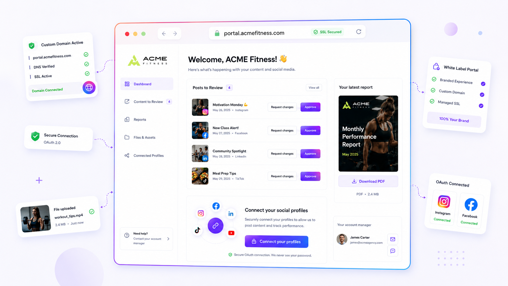
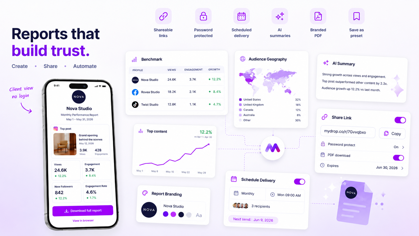
The goal here is to shift your mindset from treating reporting as a task to treating it as a product. When you use our report builder, you define your client’s reporting requirements once: the specific profiles, the metrics that move the needle for them, the sections of the business they care about, and, crucially, the branding. You save this setup as a reusable template.
When it comes time for the next report, you aren’t starting from a blank page. You open your template, define the date range, and let the system generate a durable, client-ready package. Because the platform understands your brand identity, the branded PDF that pops out is immediately ready to send-logo, fonts, and colors exactly as they should be.
Here is where the workflow really changes: the system doesn't just display the data; it helps you tell the story. Our integrated AI narrative synthesis analyzes the trends across the selected date range and drafts a summary, explaining why the numbers shifted, rather than just showing the raw charts. You take those few minutes to review the summary, add your own strategic insight, and you are done.
By generating a stored, durable report run instead of relying on a live, view-only dashboard, your team builds a library of historical insights that are always accessible. It turns a chaotic weekly fire drill into a background process that just… works.
A simple shortlist checklist
Before committing to a new reporting platform, run your current or prospective tools through this audit. If a platform struggles on any of these four points, your team is likely signing up for another season of manual spreadsheet work.
| Capability | What to look for | Decision Rule |
|---|---|---|
| Reusable Templates | Can you save a full configuration of metrics, sections, and filters? | If you have to rebuild the report structure more than once, it's not a template. |
| Branded PDF Export | Can you truly own the look with custom logos, colors, and cover pages? | Your reports should look like your work, not a third-party software's advertisement. |
| AI Narrative Sync | Does the AI provide context on trends, or just describe the charts? | If the tool can't explain the "why," you are still doing the heavy lifting. |
| Multi-Profile Bundling | Can you group related brands together for one-click reports? | If you have to run reports brand-by-brand, you're not scaling-you're just busy. |
Decision check: If your reporting software requires a human to "assemble" the report, you have already lost the efficiency battle. Software should generate the package; humans should narrate the outcome.
The path forward
The transition to a template-first reporting cadence is rarely a massive, overnight migration. It’s an iterative process of documenting what you’re currently building manually and then codifying those requirements into your platform. Start by taking your most frequent, high-effort client report and treating that as your pilot project. Build the template in your reporting builder, verify that the AI summary captures the key performance drivers you usually have to write by hand, and then move that client over to the automated workflow.
Once your team sees the time they get back, they will likely start aggressively looking for other manual bottlenecks to automate. That is when you know your reporting operating system is truly working.
When your reporting engine runs like a background process-automated, consistent, and perfectly on-brand-your strategists stop being data-entry clerks and start being, well, strategists. They get to spend their time on campaign innovation, creative testing, and long-term planning, rather than worrying about whether they remembered to update the footer date in a slide deck. The goal isn't to make reporting "fun"-it's to make it boringly efficient, so your team can focus on the work that actually earns the client’s trust.