
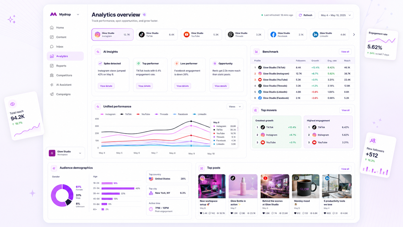
Stop chasing absolute follower counts and raw engagement numbers. They are vanity metrics that disguise your actual performance. Instead, map your profile performance against a normalized peer average within your own workspace to immediately surface which brands are dragging down your team’s collective return on effort.
We get it: you are juggling a dozen accounts, each with its own rhythm and audience. Looking at individual dashboards feels like trying to read a dozen different languages at once. It is noisy, it is exhausting, and it is impossible to defend your team’s output when you cannot prove what is actually falling behind.
The operating problem this solves
The awkward truth is that your "star" brand might be coasting on historical momentum, while a "quiet" account is actually doing the heavy lifting relative to its size. When you rely on absolute numbers, you inevitably waste 30% of your time optimizing the wrong accounts. You are essentially trying to compare a local boutique's engagement to a global flagship's reach. It is a logic trap that makes your analytics data a crime scene rather than a management tool.
Here is where teams usually get stuck: they export everything to Excel, spend three hours normalizing data, and then present a report that is already two weeks out of date. At Mydrop, we designed our Analytics Dashboard to cache these snapshots precisely so you stop waiting for slow API calls on your Monday morning review.
The real failure mode here is coordination debt. When you treat every profile as an island, you lose the ability to see systemic issues-like a specific creative format that is consistently failing to connect across your entire portfolio. You are not just missing data; you are missing the signal that tells you when it is time to pivot your strategy.
Operator rule: If you cannot explain the performance delta between two profiles in under 60 seconds, you are looking at too much data.
When you benchmark against your own internal portfolio baseline, the noise fades. You start seeing the difference between a bad post and a systemic format mismatch. This shift from "How many likes did we get?" to "Why is this brand performing at 40% of our portfolio average?" is the difference between being a social media operator and just another content churner.
Below is how this looks when you stop measuring in vacuums and start measuring by impact.
| Profile Name | 30-Day Engagement Rate | vs. Portfolio Baseline | Action Item |
|---|---|---|---|
| Brand A (Flagship) | 4.2% | +0.5% | Maintain current cadence |
| Brand B (Regional) | 1.8% | -1.2% | Shift to short-form video |
| Brand C (Niche) | 3.5% | -0.2% | Review community response |
Note: Baseline calculated as the median engagement rate across all active workspace profiles in the last 30 days.
The minimum system that works

You need a baseline that actually reflects your reality, not a set of generic industry averages that mean nothing to your specific brand. The most effective way to identify a laggard is to build a Portfolio Baseline-an internal average calculated from the performance of all profiles in your workspace.
At Mydrop, we designed the Analytics Dashboard to cache these performance snapshots precisely because nobody has time to wait for slow, recursive API calls when trying to prep for a Monday morning stakeholder meeting. By looking at your own aggregated data, you stop chasing phantom benchmarks and start addressing real gaps in your content distribution.
Here is a simple scorecard to help you run this process in under 10 minutes.
Weekly Health Scorecard (Example)
| Profile Name | Engagement vs. Baseline | Primary Diagnostic | Action Item |
|---|---|---|---|
| Brand A (Primary) | +12% | High video completion | Double down on short-form |
| Brand B (Secondary) | -15% | Low comment volume | Launch community query prompt |
| Brand C (New) | -40% | Missing reach | Audit connection status |
To maintain this, keep the math simple. If your workspace average engagement rate is 2.5%, any profile falling below 1.75% (a 30% delta) earns an immediate "deep dive" flag. Anything above 3.5% is your "content gold mine" that deserves more budget or resources.
Where teams overbuild the process
The most common trap we see in enterprise marketing is the "spreadsheet fever." Teams will spend hours every Monday manually exporting data from three different platforms into a master Excel file, only to realize the data is already 48 hours old and disconnected from current campaign logic.
The spreadsheet usually becomes a crime scene. It is filled with static numbers that don't account for recent algorithm shifts, and by the time you've formatted the pivot tables, the "insights" you've found are essentially archaeology.
Decision check: If your reporting workflow requires you to manually copy-paste more than two metrics, you have a distribution problem, not a measurement problem.
Teams that stay lean don't build reports; they build dashboards that refresh. When you use the cached results in the Mydrop dashboard, you move from "collecting data" to "interpreting patterns." Because the system handles the daily refresh across all your connected profiles-from X to LinkedIn and TikTok-you are always looking at the same 30-day window. You stop arguing about which data source is "correct" and start focusing on why Brand B’s engagement slumped while Brand A’s soared.
If you find yourself opening an empty cell in a spreadsheet, close it. You are trading your most valuable asset-your time-for the illusion of control. Real visibility comes from comparing your own internal benchmarks, not from the time spent cleaning up yesterday's data.
How to run the cadence
Stop treating analytics as a quarterly autopsy. If you are waiting for a monthly report to notice a dip in engagement, you have already lost the month. Instead, implement a 10-minute Monday Morning "Pulse Check".
This isn't about deep-diving into every comment thread or creative nuance; it is about surfacing what is broken so you can fix it before the Tuesday publication cycle.
- Open the Dashboard: Navigate to Analytics > Dashboard. Let the cached data load. At Mydrop, we cache these workspace summaries specifically so you aren't stuck waiting for a dozen different APIs to ping while your coffee gets cold.
- Filter by Portfolio: Select your top three to five peer profiles. If you are a regional manager, group them by market. If you are an agency, group them by client category.
- Scan the Benchmark: Ignore the absolute total reach. Look at the
Engagement Rate vs. Baselinecolumn. - Flag the Outliers: If a profile is 15% below its own 30-day average, note it. If it is 30% below, it is an immediate priority for the weekly sync.
- Assign the Fix: Don't ask "why is this happening" in a vacuum. Check the diagnostic map below to see if the issue is a broken connection, a format shift, or just a lazy content week.
Workflow check: Never ask your team to "fix the engagement" on a brand without defining the gap relative to its own baseline. If the baseline is low, you are optimizing for a dead end.
The proof that the habit is working
When you move from absolute vanity metrics to relative benchmarking, you stop guessing and start operating. We see teams turn around underperforming accounts in as little as two weeks by applying this precise diagnostic logic.
Illustrative Diagnostic Matrix
| Metric Drop | Likely Source | Action Item |
|---|---|---|
| Reach < 20% vs Baseline | Format mismatch | Audit recent visual assets; are you posting static when the audience wants video? |
| Engagement < 30% vs Baseline | Community neglect | Check response logs; are comments or shares being ignored for > 24 hours? |
| Data Gaps / Zeros | Connection health | Run a manual refresh in the Mydrop dashboard to check for auth/API permission errors. |
| Impression Stagnation | Cadence fatigue | Compare your posting frequency against your highest-performing peer account. |
The most common trap is the "Spreadsheet Crime Scene." Teams take these numbers, export them into a massive, unreadable Excel file, and then spend four hours formatting cells before they even look at the data. Keep the analysis inside your dashboard cache. If you aren't taking action within 10 minutes of opening the screen, you are just looking at a screen, not managing a brand.
Conclusion
The uncomfortable reality for most large teams is that you don't have a content problem. You have a coordination bottleneck. You have plenty of assets and enough budget, but you are wasting massive amounts of energy pushing content into channels that are already stalled, all because you are staring at absolute numbers that lie to you.
Stop chasing the industry-wide vanity metric. Anchor your strategy to your own performance baseline, tighten your weekly feedback loop, and start treating your profile portfolio as a system that requires constant tuning, not just a set of buckets to fill. When you see an account dropping relative to its own potential, you don't need a committee meeting to diagnose it. You need five minutes, the right dashboard view, and the discipline to act on the gap.