Stop copy-pasting screenshots into slide decks. If you are spending the first three days of every month manually pulling platform data and formatting it to match a brand, you are not doing analytics. You are doing high-priced data entry.
We get it. You want to provide deep, insightful analysis for your clients, but the messy middle of gathering metrics across five different platforms turns your Friday afternoon into a spreadsheet-filled nightmare. You are exhausted by the repetition, not the strategy. The good news is that standardized, template-driven automation is the only way to scale agency reporting without sacrificing the narrative quality your clients actually pay for.
By shifting to a preset-based cadence, you stop chasing numbers and start delivering insights.
The operating problem this solves
The real enemy of a good analytics practice is coordination debt. Every time you manually compile a report, you are effectively paying a "spreadsheet tax" on your team’s capacity. You are likely rebuilding the same slide deck structure, re-applying the same brand colors, and re-calculating the same platform-specific metrics for every single client. This isn't just inefficient; it is a fragile, error-prone process that falls apart the moment a client asks for a custom date range or a specific platform breakdown.
When you manage dozens of brand profiles across multiple markets, manual reporting creates a massive bottleneck. The team gets stuck in a cycle of "export and paste" instead of "review and refine."
Consider how the time actually gets spent across a typical monthly cycle:
| Activity | The Manual Slog | The Automated Cadence |
|---|---|---|
| Data Aggregation | 4-6 hours (platform hopping) | 0 hours (system sync) |
| Formatting/Branding | 2-3 hours (per report) | 0 minutes (template apply) |
| Narrative Synthesis | 1 hour (reactive) | 30 mins (proactive/AI check) |
| Stakeholder Review | 1 hour (email chains) | 5 mins (link delivery) |
| Total Per Client | 8-11 hours | < 45 minutes |
The math is simple: If you save eight hours per report for a portfolio of twenty clients, you recover nearly two hundred hours of billable, creative time every month.
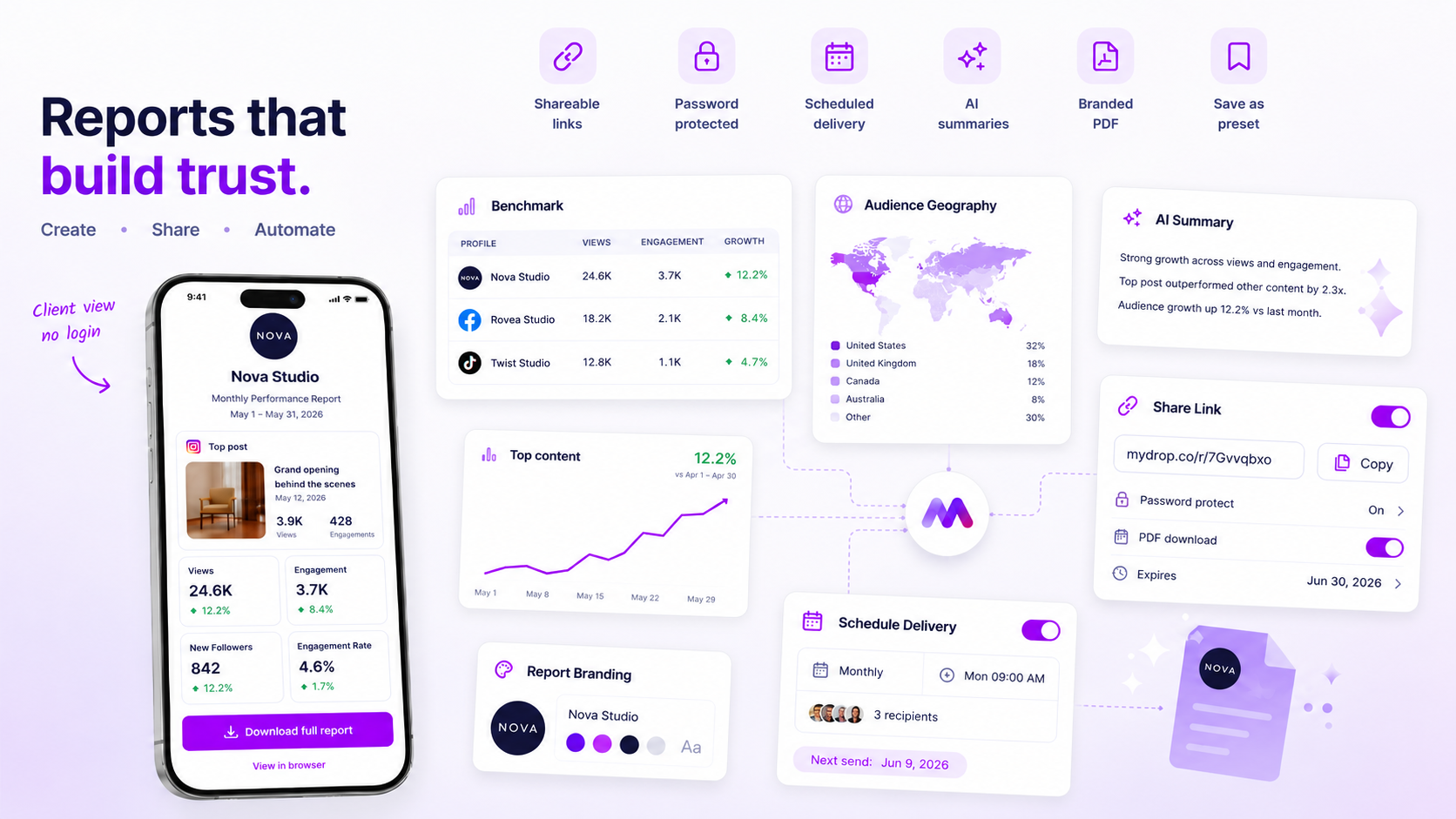
Most teams do not have a data problem. They have a decision bottleneck. They are so focused on the act of reporting that they never stop to curate what actually matters. When you use an automated system, like the report builder in Mydrop, you aren't just saving time on exports. You are enforcing a standard of quality. By utilizing reusable presets, you ensure that every client report-whether it is for a boutique brand or an enterprise account-follows the same professional structure, branded correctly, every single time.
You move from "Did we capture the right screenshot?" to "What story does this data tell?"
The minimum system that works
The secret to sane reporting is simple: stop building, start applying. If you find yourself hunting for a logo, manually recoloring charts to match a client style, or deciding which metrics to include for the third time this week, your workflow is fighting you. A minimum viable system relies on one thing: a reusable template.
In Mydrop, we suggest teams treat their first report as a prototype. You pick your profiles, define your date range, select the top-line metrics that actually drive business conversations, and apply your agency branding once. Then, you save it as a preset. From that point on, you aren't "building" a report; you are simply hitting "apply" and letting the system hydrate the data.
Here is what your core configuration should look like to keep things lean:
| Component | Minimum Requirement | Why it matters |
|---|---|---|
| Data Scope | Fixed profile groups | Removes the need to manually toggle accounts every time. |
| Date Preset | Last Month or Last 7 Days |
Ensures a consistent, reliable look-back period. |
| Branding | Logo + Brand Colors + preparedBy |
Shifts the report from "raw data" to "client-ready asset." |
| Sections | 3-4 high-impact widgets | Prevents data overload; keeps clients focused on outcomes. |
| Narrative | AI-generated summary | Gives the client the "so what" before they look at charts. |
Operator rule: If a section in your report doesn't lead to a question from your client, remove it. Reporting should be a conversation, not a data dump.
Where teams overbuild the process
Most reporting systems eventually collapse under the weight of "just one more chart." We have seen teams at large agencies create 40-page PDFs that no one reads, simply because they are afraid to leave a metric out. This is a classic case of coordination debt-you are spending hours perfecting a document to prove your worth, when the client really just wants to know if they are hitting their targets.
The trap is believing that more data equals more value. In reality, a massive report is often just a mask for a lack of clear strategy. When you force your team to build custom, bespoke reports for every single stakeholder, you aren't being "high touch"-you are creating a bottleneck.
The most common failure mode we see is the "kitchen sink" approach:
- Adding every available metric: Including reach, engagement, sentiment, and clicks for every platform, even if they aren't relevant to the current campaign.
- Infinite customization: Adjusting font sizes, chart types, or color palettes for individual clients instead of maintaining a consistent brand standard.
- Manual post-processing: Exporting data, cleaning it in a spreadsheet, then importing it into a slide deck.
At Mydrop, we recommend establishing a standard "core" report that covers 90% of your clients' needs. If a client needs something special, that is the exception, not the rule. If the exception becomes the standard, you have a process problem, not an analytics problem.
Common mistake: Treating report design as a creative exercise. Your report should be a utility, like a utility bill or a bank statement-boring, predictable, and immediately understandable.
By standardizing the layout and automating the production, you free your team to focus on the remaining 10%-the actual human analysis that explains why the numbers moved. That is where you earn your retainer, not in the formatting of a PDF.
How to run the cadence
Once you have your presets locked in, the goal is to shift from "project manager" mode to "quality control" mode. Automation isn't about removing human oversight; it’s about giving yourself the headspace to actually look at the data instead of just moving it around.
At Mydrop, we suggest a simple three-step monthly rhythm to ensure your reporting stays meaningful without becoming a drain on resources:
- Trigger the Run: On the first working day of the month, open your report preset. It should already have the correct profiles, section order, and branding snapshots selected. Just update the date range to
lastMonthand hit generate. - Review the AI Narrative: Since your report builder includes automated summaries, spend your energy here. Verify that the AI-highlighted trends match the actual campaign sentiment. If a specific post went viral for reasons the data doesn't fully capture, add a two-sentence note to the report narrative to bridge that gap.
- Delivery and Archive: Once the branded PDF is generated, download it or deliver it through your internal portal. Because the report run is stored, you have a permanent, durable record of exactly what the client saw, which is invaluable if you ever need to revisit historical performance months down the line.
Decision check: If you find yourself manually editing more than 20% of the report content after generating it, your template is too generic. Update your preset to include the specific metrics or post-list filters that you find yourself manually adding every time.
The proof that the habit is working
How do you know you have successfully moved from data entry to analysis? You will see a tangible shift in how your team spends their time and how your clients respond to the material. When the spreadsheet tax is eliminated, the conversation changes from "why did these numbers drop?" to "what should we do differently next month?"
Here is a simple way to score your progress:
| Activity | The Old Way (Manual) | The New Way (Automated) |
|---|---|---|
| Data Aggregation | 4-6 hours per month | 5 minutes (Preset run) |
| Styling & Formatting | 2-3 hours per month | 0 minutes (Branding lock) |
| Strategic Insight | 30 minutes (After exhaustion) | 90+ minutes (Fresh focus) |
| Report Consistency | Fragmented / Human error | 100% standardized |
If your team is spending less than 10% of their reporting time on formatting and data assembly, you have reached the efficiency sweet spot. You aren't just saving time; you are protecting your team from the burnout that comes with repetitive, low-leverage tasks.
Conclusion
The messy middle of agency reporting isn't an inevitable part of the job. It is a coordination failure. When you treat reports as durable, repeatable assets rather than one-off documents, you stop losing hours to the grind.
Take this week to build your first three core presets-perhaps one for your high-growth accounts, one for maintenance clients, and one for experimental campaigns. Once you move from manual creation to template-driven delivery, you’ll find that the real value of your analytics isn't the report itself, but the time you’ve bought back to actually improve the results inside it.