You are five minutes away from a client briefing, and you need to explain why engagement dipped yesterday. If your first instinct is to open ten different platform tabs and start manual calculations, you are not just wasting time, you are failing your clients. The best analytics dashboard does not just show you vanity metrics; it provides a single, cached source of truth for your daily performance decisions, allowing you to bypass manual data gymnastics entirely. Relying on volatile, hour-by-hour data creates decision-making paralysis. Instead, look for a platform that prioritizes a stable, daily-refresh baseline. This gives your team the signal they actually need to pivot strategies, without drowning in the noise of minor, mid-day fluctuations.
We get it. Managing social media for dozens of enterprise brands is messy. It is a relentless, high-stakes grind of trying to extract signal from a flood of notifications, platform updates, and urgent client requests. The "real-time" promise of most tools feels like a relief until you realize you are just staring at uncontextualized numbers that change every hour, forcing you to constantly second-guess your own strategy.
What the best tools need to handle

The dashboard is not just a screen; it is your primary operating lever. To stop the manual churn, a tool needs to move beyond simple data retrieval and start offering structured utility. If you are still using spreadsheets to bridge the gap, your tool is failing your core business need.
To cut through the noise, use this scorecard to audit your current stack.
| Feature | Score (1-5) | Definition |
|---|---|---|
| Data Consistency | 5: Identical numbers across sessions. 1: Volatile, unstable data. | |
| Multi-Profile Benchmarking | 5: Native cross-brand comparison. 1: Requires separate exports. | |
| Refresh Reliability | 5: Fully automated daily cycles. 1: High manual refresh cooldowns. |
- Automated, daily refresh: Your dashboard should be ready when you are, not waiting on a user to manually trigger data pulls.
- Standardized Metric Families: Whether it is X or TikTok, the dashboard must normalize data points so you can compare performance apples-to-apples across brands.
- Cached Stability: The data should reflect a complete, finalized picture of the previous day, preventing teams from chasing phantom dips that disappear after an API update.
At Mydrop, we prioritize the 30-day signal precisely because we see how daily volatility causes decision-making paralysis.
Common mistake: Treating a missing metric as a zero rather than an error. The best tools distinguish between poor performance and an API permission failure, preventing false alarms.
Where basic tools start to break

Let’s talk about why most dashboards fail when the heat turns up. The biggest issue is not the UI. It is the data philosophy. Most tools treat social data like a live stream, constantly updating metrics every hour. It sounds smart, but for a team managing fifty profiles, it is a disaster. You end up with decision paralysis because the numbers change while you are looking at them.
Then, there is the spreadsheet trap. When your dashboard cannot handle a unified view, your team spends three hours every Monday morning manual-exporting data from X, LinkedIn, and TikTok just to make a pivot table. That is not marketing. That is data entry, and your best people are doing it when they should be strategizing.
Worse yet is the technical failure of silence. Many platforms treat a missing metric, such as one from an expired token or a restricted API permission, exactly the same as a zero. You end up reporting that a campaign had zero impressions when, in reality, your connection simply dropped. You look incompetent to the client, not because your strategy failed, but because your tool lied to you.
The buying criteria that matter
If you are tired of the daily data gymnastics, it is time to upgrade your requirements. When evaluating a tool for your agency or enterprise brand, stop looking for "real-time" and start looking for reliable cadence.
Use this scorecard to audit your current provider. If your tool cannot check these boxes, you are paying for technical debt, not intelligence.
| Feature | Score (1-5) | Why it matters |
|---|---|---|
| Data Consistency | You need the same report at 9am and 5pm. | |
| Multi-Profile Benchmarking | Can you compare Client A vs. Client B instantly? | |
| Refresh Reliability | Is the daily refresh automated or a manual headache? | |
| Missing Metric Handling | Does it show a gap, or does it guess with zero? |
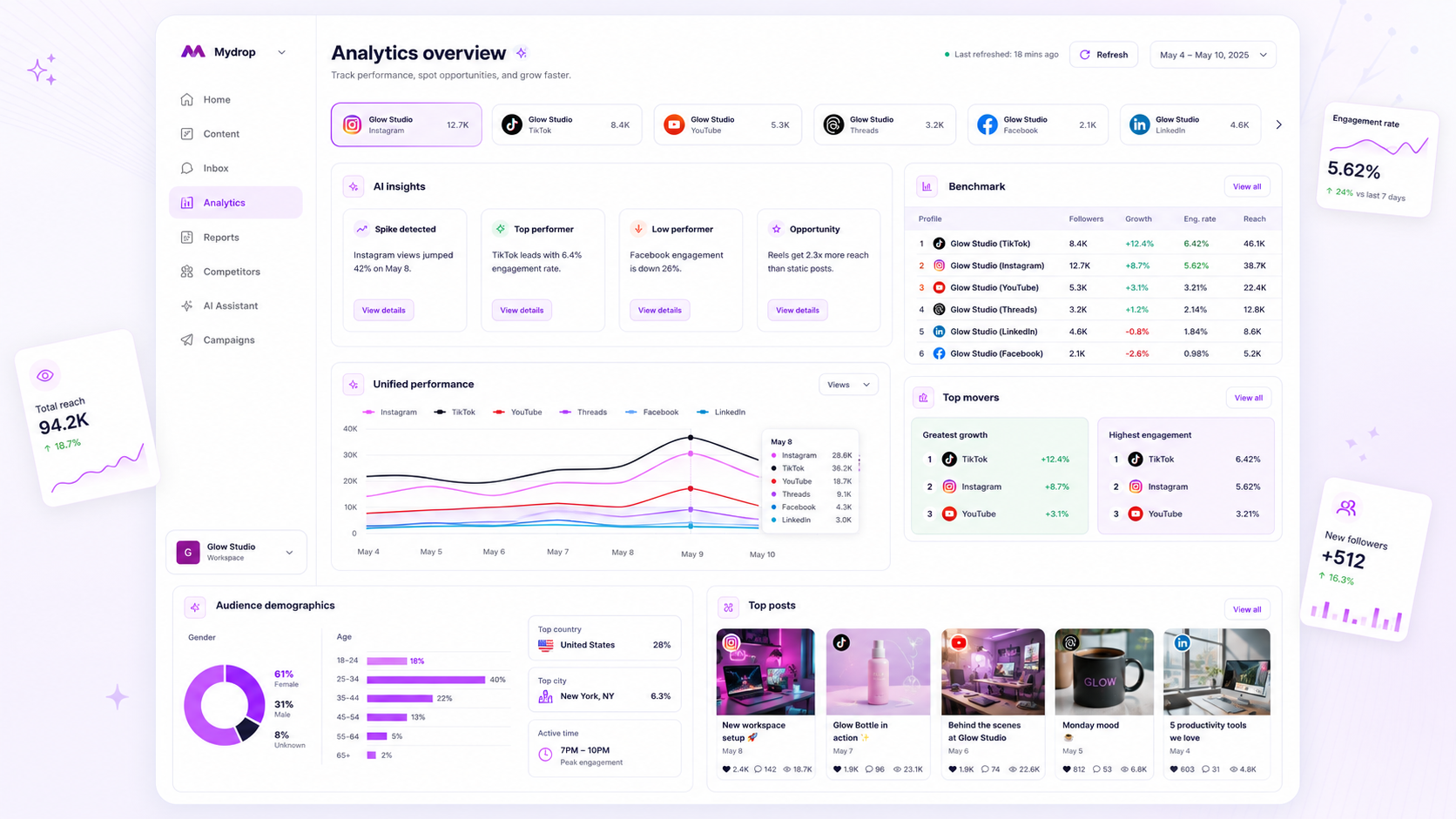
The most important criterion is how the tool handles the "30-day signal." You do not make decisions on hourly volatility. You make decisions on trends. Look for a system that caches the last 30 days of data and performs a daily, automated refresh. At Mydrop, we intentionally prioritize this cached approach because we know that enterprise teams cannot afford to chase ghosts in the data.
When you stop obsessing over the last 60 minutes and start looking at the last 30 days, your strategy becomes much clearer.
Operator rule: If your dashboard requires you to manually click refresh for more than one profile, it is not a tool. It is a chores list.
The right tool should give you a high-level benchmark across platforms. You need to know if your TikTok engagement is healthy compared to your Instagram baseline without building a separate manual report for each. If the tool forces you to keep the platform open to understand the metrics, the dashboard is just a glorified screenshot.
A true enterprise-grade analytics dashboard handles the heavy lifting, cleaning, and normalization of platform data in the background. It should deliver a stable, reliable view of your performance while your team focuses on acting on that information, not verifying it.
How Mydrop supports this workflow
At Mydrop, we decided early on to stop chasing the "live dashboard" mirage. We know that if you are managing fifty brand profiles, you do not need to see what happened on Instagram exactly four seconds ago. You need to know if the strategy you tweaked three days ago is actually moving the needle.
Our approach centers on stable, daily-refreshed cached data. When you open your Mydrop Analytics Dashboard, you are looking at a curated summary of your workspace-across Facebook, TikTok, LinkedIn, or YouTube-that is ready to go. You do not spend your morning clicking "refresh" on ten different browser tabs. We handle the data collection in the background, so the dashboard is ready when you are.
We also know that enterprise teams work in "benchmark mode." Whether you are comparing Client A’s latest campaign against their own 30-day average, or benchmarking performance across different markets, Mydrop lets you flip through those profiles without navigating back to a main menu. It is all in the same cached workspace. We also make sure that missing metrics-like when a specific X API permission is missing-are clearly surfaced, so you are not fooled by "zero" engagement numbers that are actually just access errors.
Decision check: If your analytics tool forces you to wait for a manual refresh before a morning stand-up, you have already lost the battle for efficiency.
A simple shortlist checklist
If you are evaluating tools to end the "data gymnastics," use this checklist before you sign that enterprise contract.
| Evaluation Item | Must-Have Criterion |
|---|---|
| Caching Strategy | Does the dashboard load instantly via cache, or do you wait for live API calls? |
| Automation | Does the system perform a daily refresh without user intervention? |
| Metric Standardization | Can it compare "Engagement" across TikTok and LinkedIn without manual math? |
| Error Transparency | If an API permission is missing, does it tell you why, or just show a zero? |
| Historical Stability | Does the 30-day trend line remain stable, or does it shift if you check it at noon vs. 4pm? |
Beyond this table, look for these three workflow triggers in any tool you consider:
- Automatic reconciliation: The tool must handle API rate limits and token refreshes for you.
- Workspace-level views: Can you see the "health" of all your clients in one view, or must you log in to each account individually?
- Actionable history: Does it prioritize the "30-day signal" over the noise of the last hour?
Conclusion
Most teams do not have a content problem. They have a coordination and data-synthesis bottleneck.
Stop treating analytics like a chore that needs to be "checked." Treat it like a feedback loop that informs your next set of creative decisions. The goal is not to have more data points on a screen; the goal is to have the absolute clarity needed to decide what to double down on and what to cut by tomorrow morning.
Your tools should work for you, not the other way around. If you are still manually aggregating data to explain a performance dip, you are not just burning hours-you are holding your strategy hostage to your own infrastructure. Find a tool that actually understands the pace of an enterprise social team, and stop wasting your best creative energy on manual data entry. You deserve a dashboard that tells you what happened, why it matters, and what you should do next-without making you earn the answer through manual labor.