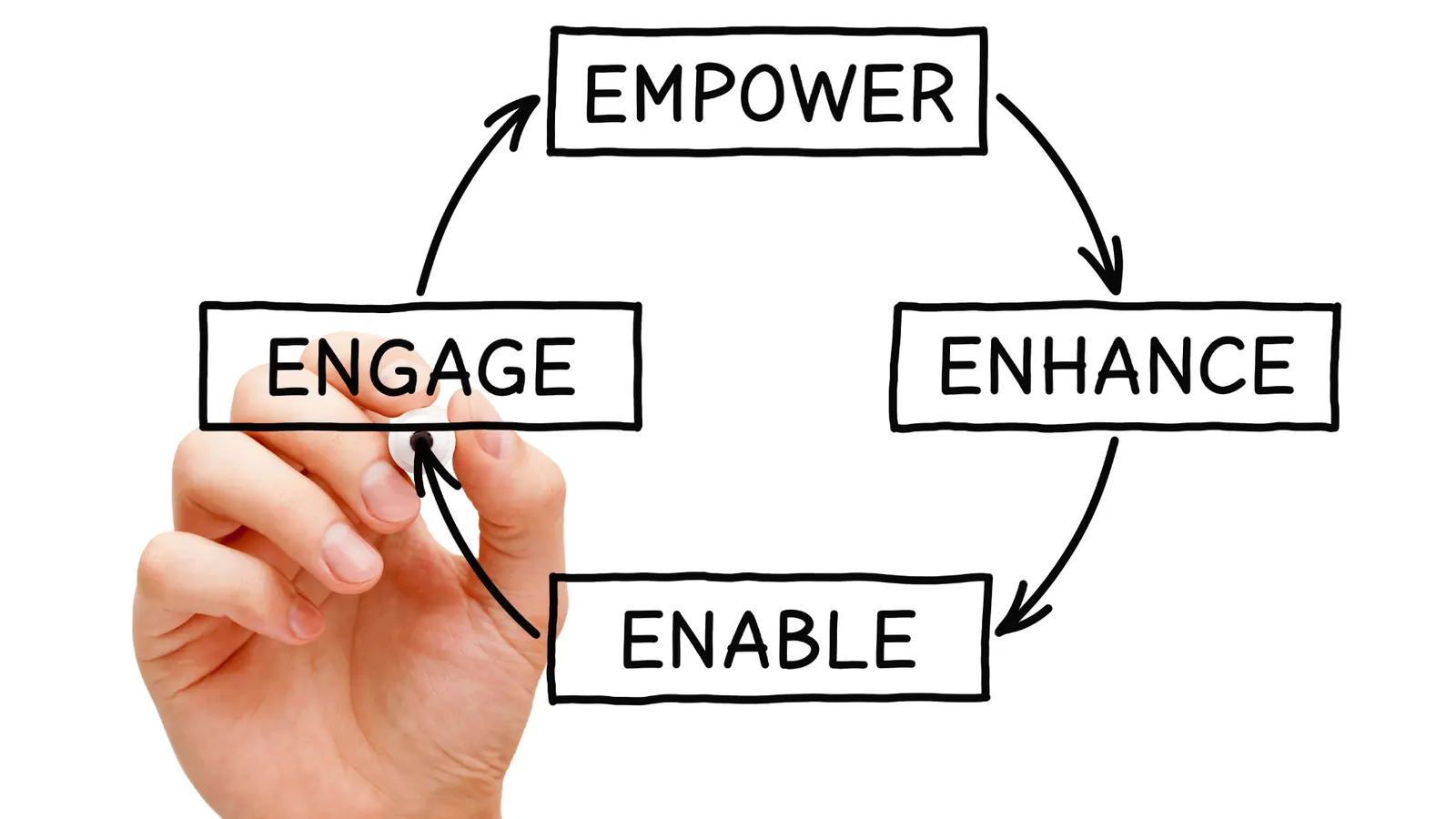

Your content quality is dropping because your brand guidelines are too far away from your "Publish" button. In multi-brand environments, quality rarely dies from a lack of talent; it dies from Coordination Debt. This is the slow, silent drift that happens when your strategy lives in a beautiful Notion doc or a 60-page PDF, but your daily execution happens in a vacuum. When a creator has to switch apps or dig through a folder to remember your specific tone-of-voice rules for Brand B versus Brand C, they simply won't do it. High-velocity teams don't need more "creative inspiration": they need less distance between the rule and the result.
We have all been there. You spend months polishing a brand identity, only to watch the actual social feed become a game of "brand telephone." By the time a post makes it through three different tools and four rounds of Slack feedback, the original soul is gone. You end up with "generic corporate" energy, slightly off-brand fonts, and emojis that feel like they were picked by a committee that hasn't seen the sun in weeks. It is exhausting to play Brand Police 24/7 when the system itself is designed for drift.
What changed before the numbers moved

Before the engagement metrics tank or the sentiment scores shift, something else happens: the "vibes" get weird. This is the Quality Drift. When you manage five, ten, or fifty profiles, you aren't just scaling volume; you are scaling emotional resonance. At Mydrop, we see this across thousands of workflows: teams often think they have a "bad creative" problem when they actually have a "context" problem.
If the person hitting "Schedule" doesn't have the same context as the person who wrote the strategy, the output will always be slightly off. In enterprise social, "slightly off" is the difference between building a community and just broadcasting noise. Here is how that drift usually looks when it is happening in real-time.
| What you see | What it actually means | The Coordination Fix |
|---|---|---|
| Inconsistent emoji use | Guidelines live in a separate tab | Embed tone-of-voice rules in the workspace |
| "Generic" captions | Feedback loops are too slow or loud | Move conversations next to the post preview |
| Logo placement errors | Asset fatigue or "just getting it done" | Centralize approved assets in the publisher |
| Missed platform nuances | One-size-fits-all scheduling | Use platform-specific validation steps |
Operator rule: The likelihood of a post being "on-brand" is inversely proportional to the distance (in clicks) between the creative asset and the brand conversation.
When you treat multi-brand management as a volume problem rather than a context problem, the spreadsheet becomes a crime scene. We get it: no one enjoys chasing approvals at 6 p.m. or explaining why a specific font weight matters for the fourth time this week. But if your team is constantly "fixing it in the scheduler," you aren't managing brands; you're just managing chaos.
The failure patterns to check first
When quality starts to slip across fifty different brand profiles, it is rarely because your designers suddenly forgot how to use Figma. It is usually because the "connective tissue" between your strategy and your execution has snapped. At Mydrop, we see this most often when teams scale faster than their workflows can handle. The result is Coordination Debt, where everyone is busy, but the output feels like a diluted version of the original vision.
You can usually spot this drift by looking for these four specific leakage points:
Context Fragmentation: This is the "Tab-Switching Tax." Your brand guidelines live in a beautiful PDF or a Notion board, your feedback happens in a frantic Slack thread, and the actual post is being built in a separate scheduler. Because the rules are "over there" and the work is "right here," creators eventually stop checking the rules. If it takes more than two clicks to verify a brand voice requirement, that requirement effectively does not exist.
The Validation Vacuum: Quality drops when there is no "pre-flight" check built into the publishing motion. We have all seen it: a post goes live with a placeholder caption or a logo from three years ago because the person hitting "Schedule" was focused on the deadline, not the details. Without a final brand-match step, you are just running a "post and pray" operation.
Feedback Decay: This is the "Telephone Game" of social media. A Creative Director gives a nuanced note on color grading, which gets summarized by a Project Manager, then pasted into a task runner, and finally read by a Junior Creator. By the time the edit is made, the nuance is gone. The more tools a piece of feedback has to travel through, the flatter it becomes.
Template Fatigue: When teams are under pressure to "just get it out," they lean too hard on one-size-fits-all templates. You end up with five different brands that all have the same visual rhythm and the same generic corporate energy. It is efficient for the calendar, but it is a slow death for the brand identity.
The proof that separates signal from noise
To fix the drift, you need to stop guessing and start measuring. We recommend running a "Quality Pulse" audit every Friday afternoon. Take five random posts from the upcoming week and run them through this rubric. This is not about being a Brand Police officer; it is about finding where the system is breaking down.
The 10-Point Brand Consistency Scorecard
Use this table to rate a sample of posts across your brands. Score each category from 0 (Fail) to 2 (Perfect).
| Category | Audit Question | Weight |
|---|---|---|
| Visual Anchors | Are the current logos, hex codes, and font weights being used correctly? | 2 pts |
| Tonal Fit | Does the caption sound like this brand, or just "generic internet person"? | 2 pts |
| Platform Native | Does the format feel built for the channel (e.g., Reels vs. TikTok style)? | 2 pts |
| Asset Integrity | Are images crisp, correctly cropped, and free of "template ghosting"? | 2 pts |
| Detail Hygiene | Are the tags, links, and hashtags correct and active? | 2 pts |
How to read your score:
- 0 to 3 (Brand Drift): Your guidelines and your execution are effectively disconnected. You are likely losing brand equity with every post.
- 4 to 7 (Functional but Fragile): You are getting the work out, but it lacks the polish required for enterprise-level trust. This usually points to "Feedback Decay."
- 8 to 10 (Scalable Quality): Your team is successfully bridging the gap between strategy and the feed.
At Mydrop, we have found that the highest-scoring teams are those that keep the "why" next to the "what." Instead of losing context in a separate app, they use features like Calendar notes and Conversations to keep brand guidelines and feedback pinned directly to the post itself.
The goal is to shrink the distance between the decision and the button. When your team can see the brand's "soul" right next to the "Publish" icon, quality stops being an extra chore and starts becoming a natural part of the workflow. The hardest truth to accept is that your content quality is not a creative problem; it is a proximity problem.
What to fix this week
You do not need a total system overhaul to see an immediate bump in quality; you just need to shorten the distance between your brand's brain and its hands. Most quality "leaks" happen because the person hitting the button is operating in a context vacuum. If you can bridge the gap between your strategy documents and the actual scheduling interface, half your problems disappear.
Start by running a "Friday Afternoon Quality Sweep." Take five random posts from the past week and look at the feedback trail. If you see the same correction being made across three different brands, you don't have a talent problem; you have a visibility problem. The "why" behind the brand guidelines is likely buried in a PDF that nobody has opened since onboarding.
The Brand Integrity Scorecard
Use this simple 10-point rubric to audit your top-performing profiles this Friday. A score below 7 suggests your coordination debt is starting to collect interest.
| Audit Category | Quality Signal | Failure Threshold | Decision Rule |
|---|---|---|---|
| Visual Anchor | Logo/Font precision | 1+ "off-brand" asset per 10 posts. | If failed, move design exports directly into the gallery workflow. |
| Tonal Fit | Emoji use and syntax | 2+ "generic corporate" captions. | If failed, pin voice notes next to the post in the calendar. |
| Platform Native | Format/Ratio accuracy | > 10% of posts feel "copied and pasted." | If failed, mandate a platform-specific validation step before scheduling. |
The "Pre-Flight" Operating Checklist
Before any post is cleared for the upcoming week, ensure the creator can answer these three questions without leaving their workspace:
- Does this caption sound like this specific sub-brand or just "the company"?
- Is the visual asset the specific social-optimized version or a generic crop?
- Where is the specific piece of feedback that changed this from draft to final?
If the answer to that last one is "somewhere in a Slack thread," your workflow is officially leaking quality. At Mydrop, we see teams solve this by moving those Conversations directly into the post preview. When the feedback lives with the asset, the nuance actually survives the trip to the "Publish" button.
When to stop diagnosing and change the workflow
There is a point where "trying harder" stops working. If your team is consistently talented but the output is consistently "fine," the machine is broken. You know you've hit this wall when the cost of coordination exceeds the value of the content itself.
In our experience, the clearest sign of a dead-end workflow is the "Correction Loop." If it takes three people and four tools to fix a single typo in a LinkedIn caption, you aren't managing social media; you are managing a digital traffic jam. At this scale, quality drops because the team is too exhausted by the process to care about the polish.
Stop diagnosing and pivot when you see these three "Red Flags":
- The 48-Hour Lag: It takes more than two days for a simple content idea to move from "Draft" to "Approved."
- The Context Split: Feedback happens in one app, assets are stored in a second, and scheduling happens in a third.
- The Compliance Shrug: Standards are ignored because finding the "official version" of a guideline takes more than three clicks.
Most teams do not have a content problem. They have a decision bottleneck. When you manage five, ten, or fifty brands, you cannot be the final filter for every emoji. You have to install a system that makes the "on-brand" choice the easiest choice for the creator to make.
Quality is not a static attribute of a creative asset; it is a function of proximity. The closer your brand guidelines, teammate feedback, and design assets are to the final calendar, the higher your quality ceiling becomes.
We built Mydrop specifically to collapse those distances. By putting Calendar notes, team Conversations, and platform-specific Automations in one place, we help multi-brand teams stop playing Brand Police and start playing Brand Leaders. You don't need a bigger team to fix your quality drop; you just need a shorter path from the idea to the feed.