By the end of this tutorial you will have compared connected profiles, chosen date ranges and presets, and surfaced clear performance trends in Mydrop to decide what to improve.
Open Analytics from the app menu. Analytics shows a default profile and a default date range when it loads. This tutorial assumes you can click the Analytics item in the left or top app menu to reach the Analytics screen.
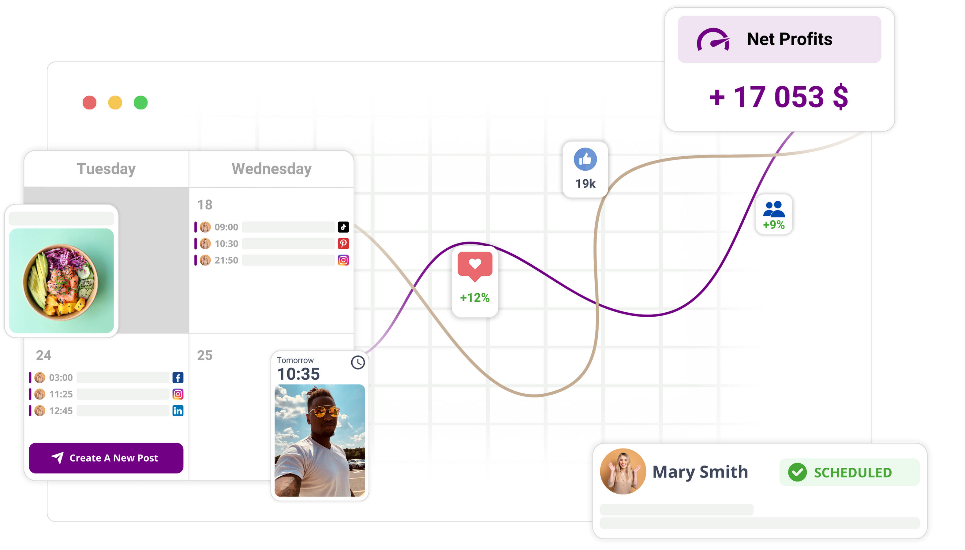
Keep each step short and focused. The goal is a side-by-side view of selected profiles showing charts and tables for the chosen date range and preset, with clear signals like rising or falling engagement and top posts.
Before you start
Confirm profiles are connected and reporting
- Verify the social profiles you want to compare appear in Mydrop and show recent activity.
- If a profile has no recent posts or no analytics data, it cannot show trends. Pick profiles that have data for the date range you plan to use.
Know the date range to compare
- Decide whether to use a preset (last 7 days, 30 days, 90 days) or a custom range.
- Match the range to the decision you want to make: short-term changes use 7 days; campaign or seasonal trends use 30 or 90 days.
Identify the decision you want to make
- Choose one outcome to guide the review: engagement (likes, comments), reach/impressions, or top-performing posts.
- Having a single decision helps pick the right preset and filter and prevents noisy comparisons.
Prepare filters and presets
- Note any filters you will need: channel, campaign, or post type.
- Decide if you will use a metrics preset (for example, Engagement view or Reach view) so you can switch quickly while reviewing.
Quick permissions check
- Ensure your Mydrop account has access to Analytics and to the workspace profiles you plan to compare.
- If you cannot select a profile, check your workspace role or ask an admin for access.
Checklist summary
- At least two connected profiles with recent data.
- A chosen date range or preset (7/30/90 days or custom).
- A clear decision focus: engagement, reach, or top posts.
- Any needed filters noted (channel, campaign).
- Permissions to view Analytics and profiles.
Why these checks matter
- Comparing profiles with no data will produce empty charts.
- Mismatched date ranges hide real trends or create misleading comparisons.
- Filters keep comparisons relevant to the campaign, channel, or post type you care about.
When the checklist is complete, proceed to Analytics with the profiles and date range chosen. The next steps will show exactly what to click to select profiles, pick presets, switch performance views, and read the charts and top-post lists to find improvement opportunities.
This part shows how to open Analytics and set the basic comparison: select connected profiles, pick a date range or preset, and apply global filters so charts and tables update to surface performance trends.
Step 1: Open the feature
- From the app menu, click Analytics.
- Watch the main view load. The screen should show a single default profile or the last profile you used, a visible date range at the top, and a set of performance charts and lists in the main area.
- Confirm the initial date range is visible (it may say a preset like Last 30 days or show start and end dates). This is the range the charts use until you change it.
- Look for a profile selector or profile name near the top of the page. Note whether it displays one profile or multiple profiles queued for comparison.
- Verify you can interact with the top controls now: profile selector, date-range control, and any global filter buttons (for channel or campaign). If any control is disabled, check the app toolbar or account permissions before continuing.
What you should see after Step 1:
- A chart area and at least one list or table of recent posts.
- A visible profile selector and a date-range control.
- Values populated for the default profile and date range, such as engagement totals or reach estimates.
Step 2: Set up the basics
Quick checklist
- At least one connected profile is shown.
- A target date range or preset is decided (for example Last 30 days).
- Any high-level filter you need (channel, campaign) is identified.
Open the profile selector.
- Click the profile name or icon at the top of Analytics.
- In the selector, click to add another connected profile for comparison. Repeat until all profiles you want to compare are selected.
- Expect the main charts to update as you add profiles. If charts do not update, confirm each profile shows a connection status and recent data.
Choose a date range preset or set a custom range.
- Click the date-range control at the top of the page.
- For quick comparisons, pick a preset such as Last 7 days, Last 30 days, or Last 90 days.
- To compare specific periods, choose Custom and enter the start and end dates.
- After selecting, look for the range to appear in the header. Charts and tables should refresh to reflect the new range.
Apply global filters if needed.
- Locate filter controls labeled channel, campaign, or similar.
- Select a channel to restrict the view to a platform (for example one social network).
- Optionally select a campaign to limit results to a campaign set.
- Click any Apply, Update, or Done control to confirm filters. The main panels should refresh.
Confirm comparison mode or presets are active.
- If Analytics offers a comparison toggle or preset (for example Compare Profiles), enable it.
- Confirm the charts now render side-by-side lines or separate panels for each selected profile.
- Check that a legend or profile labels appear on charts so you can tell which line or color belongs to which profile.
Toggle metric breakdowns to match your decision.
- Find metric options such as engagement, reach, or posts.
- Select the metric you are focusing on (engagement to evaluate interactions, reach to evaluate visibility).
- If available, switch the breakdown to per post or per profile to see whether trends are driven by specific posts or by profile-level changes.
Verify the setup visually.
- The main area should show a side-by-side view of the selected profiles with updated charts and tables for the chosen date range.
- Tables should list top posts, totals, or average metrics for each profile.
- Look for clear signals like a rising or falling line, a top-post list change, or a numeric change in totals. These confirm the comparison is working.
Save or export the view if you need to preserve it.
- If Analytics includes a Save View or Export button, use it to keep the configuration and data snapshot.
- Saving helps share the same comparison with teammates or to revisit the exact date range and filters later.
What to check before moving on:
- Charts and tables reflect the profiles you selected.
- The header shows the date range you chose.
- Filters are applied and the displayed metrics match your decision focus.
These steps ensure Analytics is opened and configured so comparisons and trend spotting produce reliable, visible signals to guide what to improve.
Outcome: Complete the comparison by switching performance views, enabling comparisons or presets, and toggling metric breakdowns so Mydrop shows side-by-side charts and tables that surface clear trends.
Step 3: Add the content or settings
Checklist before these steps:
- One or more profiles are selected and a date range is set.
- You know which metric you want to inspect first (engagement, reach, or posts).
Switch to the performance view you need.
- Click the view selector labeled Engagement, Reach, or Posts.
- Expect the main chart and the table below to update to that metric.
- Check: the chart title should match the view name and the y-axis should show the chosen metric.
Enable profile comparisons.
- Click Compare or the checkbox labeled Compare profiles (if present).
- Select the profiles you want side-by-side. Use the profile list or profile chips to add or remove profiles.
- Check: the chart draws multiple lines or columns, one per profile, and the legend shows each profile name.
Apply a preset or saved configuration.
- Open Presets or Views and choose a preset like Last 7 days, Last 30 days, or a named preset.
- If you have a saved view, select it to apply its profiles, date range, and filters in one click.
- Check: the date range indicator updates and the charts refresh immediately.
Toggle metric breakdowns.
- Look for breakdown options labeled Per post, Per profile, or By channel.
- Click Per post to see individual post contributions in the table and charts.
- Click Per profile to collapse post detail and view aggregate profile metrics.
- Check: the posts table should list thumbnails or titles when Per post is active, and aggregate totals when Per profile is active.
Add or remove global filters.
- Open filters and pick Channel, Campaign, or Tag if available.
- Apply or clear filters to narrow the dataset before interpreting trends.
- Check: applying a filter updates both charts and top-post lists to reflect the filtered results.
Save this view if you will reuse it.
- Click Save view or Save preset and name the configuration.
- Use this saved view later to reproduce the same comparison without reselecting options.
- Check: saved views appear in Presets or Views and can be reapplied.
Notes to avoid mistakes:
- If Compare is not enabled first, charts may not show side-by-side lines for multiple profiles.
- Use the same preset or date-length when comparing profiles to avoid mismatched trend signals.
Step 4: Review the workflow
Read the main charts first.
- Identify rising or falling trends in engagement or reach across profiles.
- Check the legend to match lines or bars to profiles.
- Check: a clear trend looks like a sustained slope up or down across the chosen date range, not random spikes.
Inspect the top-posts list and thumbnails.
- Open the Posts or Top content panel to see which posts drove peaks.
- Note post thumbnails, titles, or dates next to metrics.
- Check: top posts should show higher engagement or reach numbers than the average post.
Compare profile-level summaries.
- Look at the summary cards or table rows for totals like total engagement, average engagement per post, and reach.
- Rank profiles by the metric you care about to see which needs attention.
- Check: the top profile should consistently show higher totals for the selected metric.
Mark trends and pick action candidates.
- Flag posts or profiles that show falling engagement or unusually high performance.
- Note one specific decision to make, for example: "Increase posts like X" or "Test new creative for Profile Y".
- Check: you can export the list or save the view to share the candidates with your team.
Quick verification that the setup worked
- The screen shows a side-by-side comparison for the selected profiles.
- Charts and tables reflect the chosen date range and preset.
- At least one clear signal appears: rising or falling engagement, a top-performing post, or a notable reach change.
Troubleshooting tips:
- If charts are empty, recheck profile selection and the date range.
- If numbers seem inconsistent, ensure the same preset or date-length is used for all profiles.
- If filters hide expected posts, clear filters and re-run the view.
Next steps:
- Export the view or save it for team review.
- Assign follow-up actions for top posts and profiles that need testing or creative changes.
Troubleshooting and next steps
Outcome: you should end with side-by-side charts and top-post lists for the selected profiles, and clear signals to act on.
Quick checklist before fixing problems:
- Confirm the profile selector lists the profiles you expect.
- Confirm the date range or preset is the one you meant.
- Check any global filters (channel, campaign) are set or cleared.
If a profile shows no data
- Open Analytics and click the profile selector at the top.
- Look for profiles that are grayed out or show a nudge like "No data" or an empty chart preview.
- If a profile is empty, pick a different date range that includes recent activity (for example, last 7 or last 30 days).
- After changing the date range, check that the charts for that profile redraw and that at least one table row or top-post entry appears. What to expect: charts populate and the top-post list shows entries. If still empty, the selector will continue to indicate no data.
If numbers jump or look inconsistent between profiles
- Confirm the same date range or preset is selected for all profiles. Open the date picker and choose a single preset (for example, Last 30 days) rather than custom ranges that differ by profile.
- Verify the metric breakdown mode (per post versus per profile) is the same across comparisons. Toggle the metric breakdown and watch the charts update.
- If you need to compare two different periods, use the Analytics comparison option if present and choose matching period types (preset vs preset or custom vs custom). What to expect: aligned date ranges and matching metric modes yield directly comparable charts (same x-axis span and consistent metric labels).
If charts show unexpected detail or too much noise
- Check global filters near the top of the Analytics view (channel, campaign, or other available filters).
- Clear filters to see full results, or apply a single filter (for example, a single channel) to reduce noise.
- Use the metric breakdown toggle to switch between per-post and aggregate views to confirm whether noise comes from many low-performing posts. What to expect: clearing or tightening filters will change the chart density and update the top-post lists to match the filtered set.
If top posts are missing or wrong
- Confirm the selected date range covers the post publish dates.
- Switch the performance view to Posts or Top posts and let the table update.
- If the top-post list remains blank, switch to a broader date range and re-check filters. What to expect: the top-post list should show the highest-performing items for the chosen metric and range.
If a saved view or export does not match the screen
- Re-open the date range and filters to confirm they are still the same as when you saved or exported.
- Use the export or save-view controls in the Analytics screen to produce a fresh export or save a new view.
- Open the exported file or saved view and confirm the same profiles, date range, and filters are listed in the header. What to expect: the export header should list the selected profiles and date range, and the exported metrics should match what you see on screen.
Next steps after resolving issues
- Save the current view if you will revisit the same comparison often.
- Export the charts or tables for reporting or to attach to a task.
- Choose one decision to act on (for example, boost posts with rising engagement or review content themes in falling-reach profiles).
- Assign follow-up actions to teammates using your workspace workflow (attach the exported file or saved view to a task or calendar note).
- Re-run the comparison after implementing one change and use the same date range and filters to measure impact.
Conclusion
Use these checks to confirm Analytics shows side-by-side charts, consistent date ranges, and populated top-post lists for the profiles you selected. Fix issues by aligning date presets, clearing or applying filters, and switching metric breakdowns. When results look correct, save or export the view and assign a clear follow-up action so the team can act on the trends you surfaced.